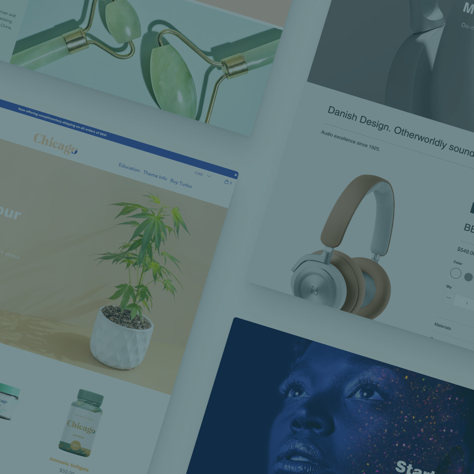
Customizing Shopify themes is not only often a bad idea, it’s often unnecessary — and that holds true with Out of the Sandbox’s newest Shopify theme, Turbo, as well as most other premium Shopify themes.
To clarify, “customization” in this case refers to directly modifying the theme’s core code — whether it be the HTML, CSS, Liquid or JavaScript.
There are, however, plenty of ways to give your site a more custom look without touching the code — which is what this post will cover.
All of the options shown here don’t require a single line of core code modification and can typically be carried over from version to version, using the Shopify Theme Updater app.
To access these settings, navigate to Sales Channels > Online Store > Themes > Customize theme (blue button) and then locate the corresponding sub-panel.
1. Colors

It’s amazing what changing just a color or two can do to make an impact on your store’s design. Premium Shopify themes have a full selection of color settings under the “Colors” sub-panel.
When considering colors, don’t forget to explore setting custom colors for all of the options you have available to you — background elements, buttons, text, links, boxes and more.
If you’re stuck for color schemes check out this post or try searching online for a color scheme generator.
2. Typography

Most Shopify themes come preconfigured to use the most popular Google Fonts, which gives you a wide selection of easy to implement and free fonts to give your Shopify theme just the right look and feel. Experiment with different types and weights for the various text elements in your theme. For example, you may like the combo of a light handwritten font with a bold sans serif for banner headlines, while using a regular weight of the same sans serif for body copy.
For font combination inspiration, check out this post.
3. Rearrange the home page

Premium Shopify themes typically let you rearrange your Shopify theme's home page. This is a great way to change how your homepage looks and functions, including experimenting with new looks or temporary changes to accommodate special sales, new products or other featured content.
Don’t be afraid to experiment a bit using these settings and change it up on a semi-regular basis to keep things fresh for returning visitors.
For example, instead of a typical slideshow at the top of the page, you might try a collection in detail layout so shoppers can dive right in and start shopping.
Or, you could try starting with an in-depth block of content (see the next point) that explains what your store is all about, so that this becomes what shoppers see and likely read first.
These settings are controlled under the “Home page” sub-panel using a series of dropdown menus that represent the order, from top to bottom, of your homepage.
4. Home page featured content
Most Shopify themes come with multiple opportunities to pull in content from other pages you create. You can use these to create large, custom blocks of HTML layouts that combine text, images and headlines with a column grid (link) to create amazing layouts.
Once you set these under the “Home page - featured content” sub-panels, you can pick which page is piped in and, using the “Home page” sub-panel, its order on the page.
Featured pages are ideal for “how it works” or “about us” type content.
Keep in mind these layouts don’t need to be restricted to shorter banner text only banners — when used with an alternating two column layout, for example, you can mimic the “checkerboard” layout found in Turbo’s featured collections.
Your featured content can also extend far down the page and use images and text to draw users in and engage them with your content — including providing links to related information or products.
5. Sidebars
Configuring Shopify theme sidebars is easy under the “Sidebar” sub-panel, including the ability to assign specific menus to help users navigate your store and display page content in various positions in the sidebar.
Adding content from pages in the sidebar is a great way to add narrow promotional content or images or other special messaging and this can all be done without touching a line of the core code.
6. Header and footer options

Premium Shopify themes come packed with many options under both the header and footer sub-panels, including logo settings, navigation menu options and areas to display additional content. Be sure to explore both of these areas and experiment with all of your options.
In Turbo, these options also include settings that adjust the layout of the header as well as mobile-only options like using a different logo on smaller devices, and you can accomplish all this without any code editing.
7. Product and collection page options
Showing and hiding various elements on product and collection pages — whether it be breadcrumb links, vendor names or tags — is easy using the the “Product page” and “Collection page” control panels.
Here you’ll find a myriad of options on not only what information these pages include but how it looks and functions. Consider adding tabs to your product descriptions or a full-width banner image to your product page, for example, or including the star rating (from the Shopify product reviews app) under each product image on your collection pages.
On the product page, which can often be a key part of the conversion funnel, you’ll find options to flip the page layout such as swapping the description and add to cart button order and, on Turbo, the position of the gallery product image thumbnails.


