


Color is one of the most important elements of designing your Shopify store. It has a huge influence on your shopper’s perception of your brand, company and products and, when used correctly, can also help boost sales.
But how do you go about finding just the right color scheme to use with your Shopify theme? We’ve gathered a few fresh palettes for your inspiration.
In each of the color schemes below, we’ve provided the HTML Hex codes for each color; this is a standardized way to indicate color for websites and is fully compatible with most Shopify theme control panels, including all of Out of the Sandbox's. To learn more about how to input these colors into your themes, see this helpful article.
Apothecary

Deep, brooding burgundy anchors this palette with a sense of heritage and quiet authority, while the two soft sage-tinged whites keep the overall feel clean and approachable. The contrast between the near-black deep red and the cool off-whites creates an elevated, curated aesthetic that feels at home in the world of wellness, botanicals, or artisan beauty. Use the dark burgundy for headers and footers to frame your content with gravitas, and let the two lighter tones layer your backgrounds and cards for subtle depth without visual noise. A natural fit for apothecary brands, organic skincare, herbalists, or any store leaning into a heritage-craft identity.
- Deep Burgundy #2e1116
- Sage Linen #e9ebdf
- Pale Sage #daded0
View demo store with this color scheme
Cherish

Warm and grounded, this palette pairs an earthy olive-khaki with a rich terracotta and a soft, creamy ivory that ties the whole scheme together. The muted khaki feels effortlessly understated, while the terracotta brings warmth and a handcrafted quality that reads as both modern and timeless. This combination works especially well for stores with a lifestyle or home goods focus — think ceramics, linen, candles, or artisan food products. Use the terracotta sparingly for calls-to-action and accent elements to draw the eye without overwhelming the calm of the overall palette.
- Olive Khaki #8b8a5b
- Warm Ivory #f9f4ea
- Terracotta #9e4b2d
View demo store with this color scheme
Amphora

This palette takes a nature-forward approach, balancing the freshness of a pale mint green against a cool neutral white and a deep forest green that grounds the whole scheme. The light tones create a spacious, airy canvas that lets product photography breathe, while the dark forest anchor brings structure and a sense of craft. The result feels simultaneously clean and earthy, which is ideal for organic food brands, plant-based products, sustainable goods, or any store that wants to signal environmental values without leaning into clichés. The deep green makes a strong header and button color that communicates quality.
- Pale Mint #eaf5d7
- Cool White #f2f2ea
- Forest Green #344322
View demo store with this color scheme
Emperor

A near-black charcoal sets a bold, commanding tone, offset by a warm off-white and a muted, dusty yellow that adds an unexpected softness. The pale yellow is the standout here: it avoids the harshness of bright primary yellow, landing instead somewhere between buttercream and parchment, which gives it a refined, vintage-luxe character. This palette works well for premium or editorial brands that want a strong visual presence without resorting to a stark black-and-white scheme. Think fashion, fragrances, specialty goods, or any store projecting understated confidence. Use the dusty yellow as a highlight for badges, banners, and featured product callouts.
- Charcoal #2c2b2b
- Warm White #f5f3ee
- Dusty Yellow #f1eeae
View demo store with this color scheme
Satchel

Bold and a little unexpected, this palette pairs a very dark espresso brown with a bright chartreuse green and a cool, airy blue-gray. The contrast between the near-black deep brown and the pop of chartreuse creates energy and visual tension, but the blue-gray steps in as a mediator, keeping the palette from tipping into novelty. This combination suits stores that want to stand out without looking loud: outdoor gear, specialty coffee, sustainable fashion, or brands that appeal to a younger audience with a discerning eye. The chartreuse is natural for buttons and CTAs, where its high contrast against the dark background demands attention.
- Espresso #27120b
- Chartreuse #d4dd8b
- Powder Blue-Gray #d4e0e0
View demo store with this color scheme
Treehouse

Vivid and sun-drenched, this palette is the most energetic of the bunch. It features a punchy golden yellow, a deep jungle green, and a bright lime, creating a trio that's hard to ignore. Rooted in nature but with an almost tropical confidence, the palette works for brands that are active, outdoorsy, or sustainability-minded but don't want to blend in. It has particular potential for outdoor lifestyle brands, garden or plant shops, eco-friendly products, and health and fitness retailers. The deep green gives the palette its grounding, ensuring the bright yellow and lime stay bold rather than chaotic. Use the golden yellow as your primary CTA color against the dark green backgrounds for strong, accessible contrast.
- Golden Yellow #fccb2d
- Jungle Green #0a4b31
- Bright Lime #aae13e
View demo store with this color scheme
Shiraz

Rich, monochromatic, and quietly luxurious, this palette pulls three deep, warm tones from the same earthy family: a dark brick red, a burnished sienna, and a muted charcoal taupe. There's no light color here to break the mood, which gives the scheme a distinctive drama that suits a very specific kind of brand: wine merchants, whisky labels, high-end leather goods, artisan chocolatiers, or any store where the product itself calls for a warm, immersive atmosphere. Use the lighter sienna brown as your primary interactive color against the dark brick backgrounds, and bring in off-white product photography to provide contrast and ensure legibility across the store.
- Dark Brick #57210d
- Burnished Sienna #7e401f
- Charcoal Taupe #45443f
View demo store with this color scheme

Vintage color schemes
Below are seven color schemes from our original post in 2015.
Venture

Subtle shades of gray mixed with a rich yet sophisticated orange shade give this color scheme a modern yet friendly look for your Shopify theme. The slate gray used in this palette has subtle hints of blues and violets mixed in, giving a more sophisticated look and feel than a typical (and more boring) gray. Use the orange for your “add to cart” button to make it easy for users to shop. This is a great option for Shopify themes that are used to sell electronics or gadgets.
- Slate Gray: #5C656D
- Rusty Orange: #DE7D00
- Ash Gray: #999999
Primary
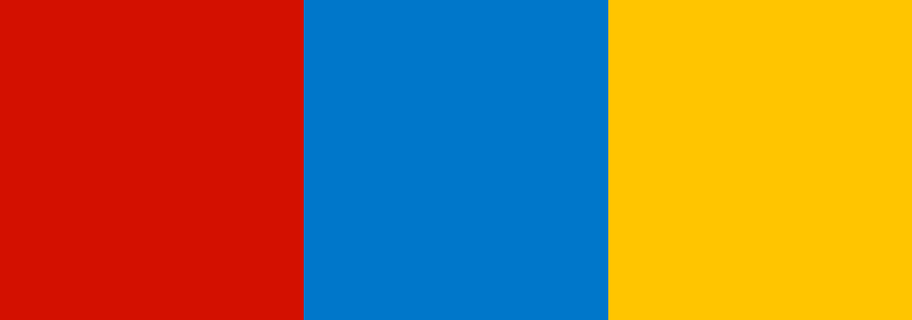
Inspired by the primary colors of red, yellow and blue but with a bit of a “grown up” twist, this color palette is a natural choice for stores that cater to the young and young at heart. It’s a great way to make your Shopify theme look feel friendly and cheerful — without being overly cutesy, so it’s a natural choice for baby and kids Shopify stores.
- Barn Red: #D30000
- Fresh Blue: #0075C7
- Goldenrod: #FFC600
Earthy
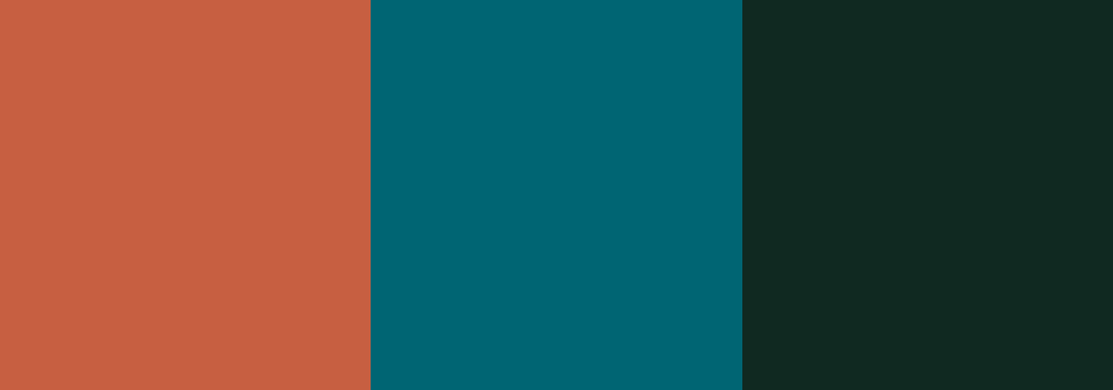
This color scheme mixed a sophisticated shade of teal with rich, warm orange-brown for a modern, updated take on earthtones. The deep teal shade, meanwhile, is almost black, but its hint of green and blue ties it in nicely with the rest of the colors. This color scheme is a great choice for Shopify themes used for selling outdoor gear, men’s goods or other high end items.
- Rust: #C75E43
- Teal: #006572
- Deep Teal: #102921
Classic

Sophisticated and fashionable, this color scheme conveys quality and richness. The black here has an almost imperceivable amount of red in it — but creates an interesting harmony between the shades. Fashion, accessory and cosmetic stores will find this Shopify theme color scheme to be a great fit.
- Wine: #990033
- Bold Black: #330011
- Parchment: #EDE9D8
Minty

A refreshing take on your typical mint tones that includes unique shades that are modern while still drawing from familiar shades. This is a great option for health and beauty products or technology Shopify store themes.
- Wintergreen: #5AFAC9
- Spearmint: #6BDEFF
- Clean Mint: #DCFCFF
Nature

This color scheme is a fresh take on many of the colors found in nature — without coming across as too earthy.
- Sky Blue: #7FD1E8
- Lime Green: #B9D221
- Grassy Green: #89C43A
- Tidal Teal: #51C3C5
Sophisticated

This simple color scheme relies on various shades of grays to create a high end look that lets photos stand out. Try mixing it with black and white or super-rich photography for two completely different looks. One point to keep in mind when using high contrast colors such as white and black — sometimes using pure white or pure black causes too much contrast, which can make text more difficult to read; so using shades that are just slightly skewed from being pure white or black is an effective technique to avoid this.
- Midnight: #333333
- Charcoal: #454545
- Mist: #ECECEC
Bonus: Sandbox

We’re a bit partial to this color scheme — because it’s based on the one the Out of the Sandbox site uses! But it’s a great way to combine subtle colors that still let your photography shine through with fresh and friendly shades of orange and blue. These colors are particularly good picks for your “add to cart” buttons or anything else you want to draw attention to since they really stand out on the screen.
- Blue Gray: #3C464F
- Fresh Blue: #479CCF
- Active Orange: #EBB129
One thing to keep in mind about colors you use in your Shopify theme design is that, depending on the manufacturer, ambient lighting conditions and individual settings, colors often display differently on different computers or devices. Also keep in mind that some people see colors differently due to color blindness or other vision conditions.
