Beyond the scroll — how to use Shopify sections to create engaging pages
Last month, we took a look at how prioritizing content is important when you design and...

Last month, we took a look at how prioritizing content is important when you design and...

In the world of ecommerce store design, many Shopify themes tend to favor using a large image or slideshow at the top of the homepage — and while this approach can and does work quite well for a variety of stores, there are also some interesting alternatives to consider.

Although all of the previous Shopify sections we’ve covered in this series have specific layouts, there are two section types that are much more wide ranging and flexible — the rich text and image section and the page section. Find out how to use these two section types in a variety of ways.

The slideshow Shopify theme section is a versatile section used for a variety of purposes in your store. At its core, the sideshow section lets you add two or more unique images that appear in sequence and link to any URL. Check out these 12 use cases for slideshow sections, included in each Out of the Sandbox theme.

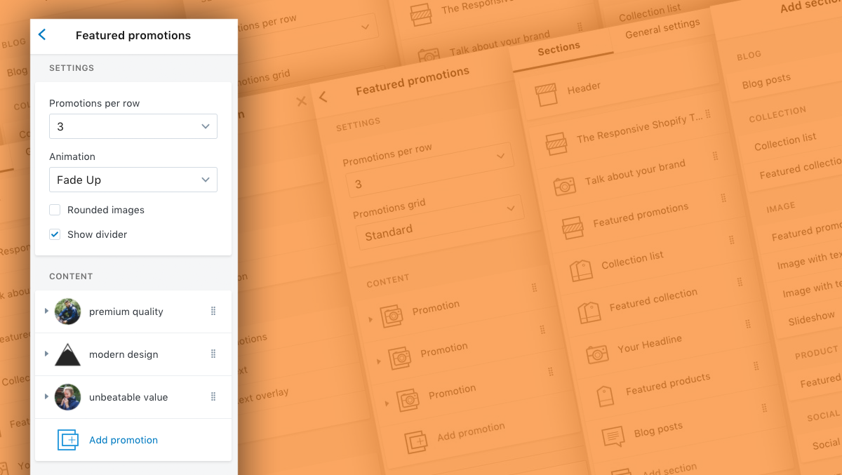
Featured promotions are simple and straightforward Shopify theme sections that rely on tried and true user interface design principles to pique shoppers’ curiosity into clicking and delving deeper into your site. Learn how to use the section over 20 ways.

Shopify recently rolled out a new theme editor interface that has some key differences from the earlier Shopify theme settings panel — but the new interface can be a bit confusing for longtime and newbie Shopify users alike. However, once you’ve gotten the general idea behind the new editor, you’ll be able to use it much more efficiently.