Beyond the scroll — how to use Shopify sections to create engaging pages
Last month, we took a look at how prioritizing content is important when you design and...

Last month, we took a look at how prioritizing content is important when you design and...

Along with a new style preset, Chicago, and some other great new features, version 2.2 of the Turbo Shopify theme also introduced a new type of section: Text columns with images. This new section lets you use a mix of image and text content in a column layout.

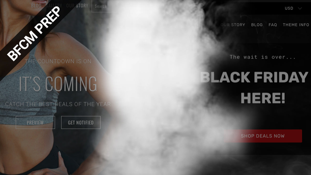
The Turbo Shopify theme’s latest style, Chicago, has a dark and sophisticated mood that’s perfect for any store that needs a clean, simple look with a bit of an edge; but its black color scheme also makes it a natural choice for Black Friday sales and opens the door to an interesting possibility.

Search is a key part of any Shopify store and it plays a key role in helping customers find the products they need — and now storefronts using the Shopify theme Turbo can add a search block to their homepage, to draw even more attention to this valuable feature.

After blasting through the Shopify theme world not once, but twice with Turbo, the Out of the Sandbox Shopify theme team is shifting the ultimate Shopify theme into the next gear — again. The newest version of Turbo also represents a big shift forward with the theme’s dedication to speed and performance.

Although all of the previous Shopify sections we’ve covered in this series have specific layouts, there are two section types that are much more wide ranging and flexible — the rich text and image section and the page section. Find out how to use these two section types in a variety of ways.