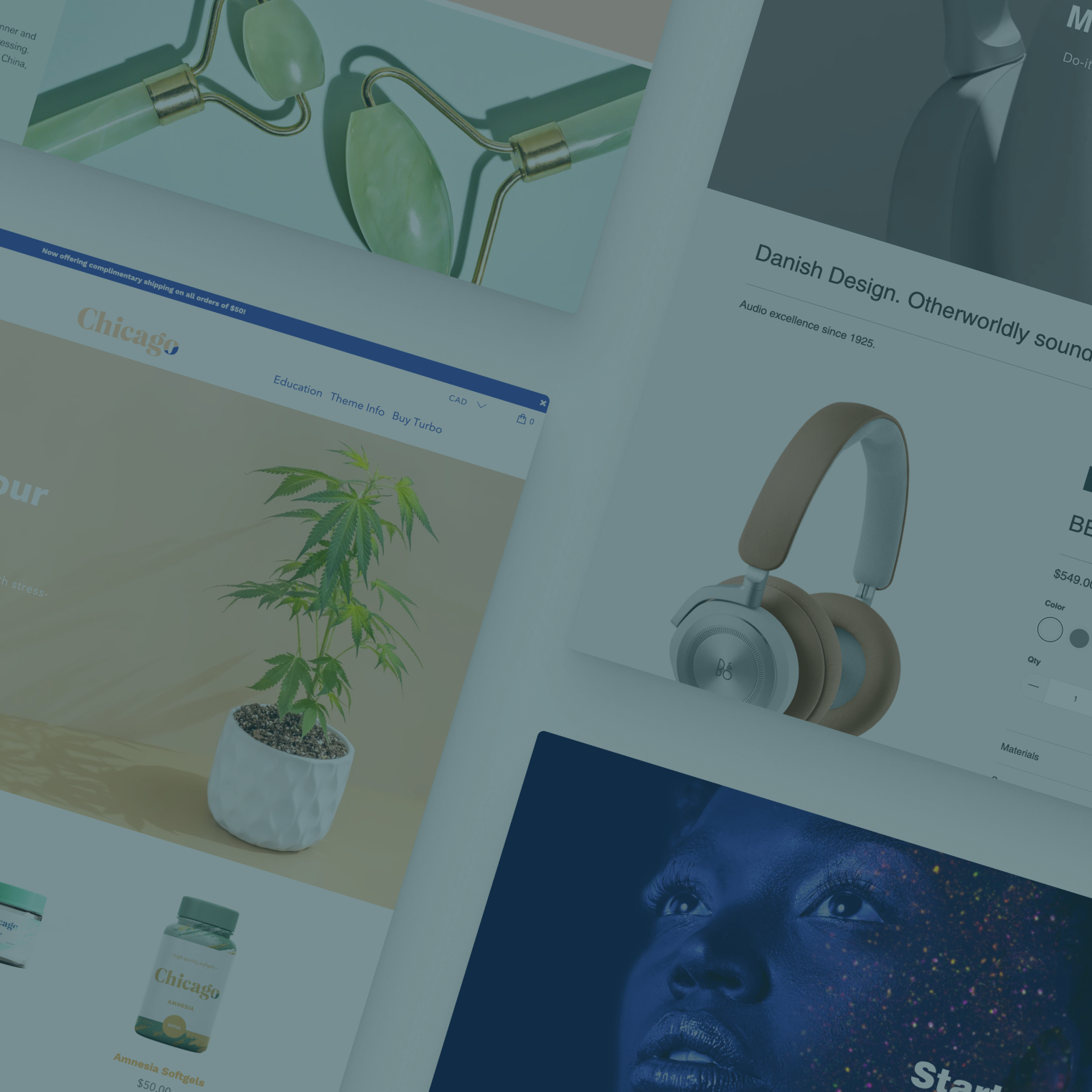
While a traditional product page features the product image, name, description and add to cart button all high up on the page, many Shopify themes have the option to create longer, more engaging product pages that educate shoppers and give them more insight into your company and items.
One of the advantages of using the space below the traditional product page layout is that you can engage with shoppers who aren’t ready to purchase by providing more details and content that draws them in — while customers who are ready to buy still have fast access to the “add to cart” functionality and basic details above.
Product details
All Out of the Sandbox themes come with a section-enabled page layout called product.details.liquid.

This layout allows you to add additional content in rich, dynamic layouts that appears at the bottom of your PDPs.
One important note about this feature is that, by default, the same content appears on every page that uses the template, though you can create unique layouts on a per-product basis using these customization steps.
However, there are still great ways to use this feature without any customization, by adding non-product-specific content:
- Spotlight your company history and story
- Highlight your design process and materials through text and images
- Add links to standalone informational pages elsewhere on your site
- Showcase your best blog posts
Full width images
The Turbo Shopify theme offers an additional product detail page option — product.full-width-images.liquid.
When this template is applied to a particular product page, any images inserted into the product description will automatically become full width (more details on this here).
You can even add text over the image by editing the image “alt” tag.

One of the advantages of this approach is that since the content is edited at the product level, each product in your store can have a unique set of images and headlines — or none at all.
Full width images have a variety of great uses:
- Use a large, high quality and carefully framed image of your product with a headline that briefly describes a unique feature
- Showcase a “lifestyle” image of your product in use with text designed to convey your brand’s tone and connect with customers
- Use a standalone image, without a headline, as a way to break up content while adding a strong visual
Again, since this content all lives within each individual product description, it can be unique to every product.

Related products
Another component to continue creating dynamic product pages, either with or without the layout options we’ve outlined already, is to activate the related products option to encourage users to explore more products.

When selecting products to appear in the related products area, consider these points:
- Keep in mind that a shopper browsing the current product may determined that this product isn’t exactly what they are looking for — so here’s your chance to provide more options that might be a better fit
- Another good option is to showcase other configurations the product is available in, such as sets or multi-packs
- Related products are also a great way to increase your purchase totals by suggesting matching or add-on items
- Another option is to showcase items that are similar in style, color or product type
Recently viewed products
In Turbo 2.1, another great content block is to add recently viewed products. Not only does this give shoppers a way to easily backtrack to a product they just saw, but it’s a great way to personalize the experience for each shopper and add a dynamic dimension to your site.


