Infinite scrolling is a commonly requested Shopify theme feature — and many store owners are quick to implement it, but there’s also a lot of strategy to consider before adding infinite scrolling to the collection pages in your Shopify theme.
Like with any decision you make for your business, it’s important to weigh all the options and pros and cons and make a decision that works best for your customers — and be willing to experiment with other settings as your store grows and evolves.
What is infinite scrolling?
Infinite scrolling refers to a Web design technique that is typically used to “chain together” blocks of content such as products or news stories.
In Shopify stores, this is most commonly needed when dealing with large inventories and collections that have hundreds or even thousands of items in them.
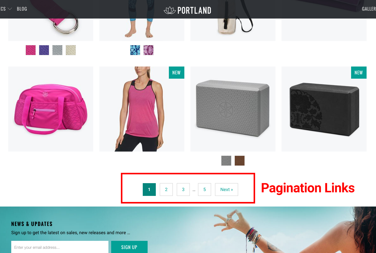
Traditionally in these cases, once the shopper has viewed, say, the first 24 products, he or she would have to click a “next” button or navigate to the next page through pagination links, which have one number for each page of products. A user can click on any number to skip ahead or backward when browsing products.

Infinite scrolling, however, detects when the users reaches the end of the first group of items and automatically loads the next group without requiring any action on the part of the user, as shown in this short video demo:
It’s worth noting that the term “infinite” is actually a bit misleading since all stores, no matter how large, don’t have infinite inventories, so the user will eventually reach the end of a collection.
Infinite scrolling is currently available in the Turbo premium Shopify theme from Out of the Sandbox.
What are the advantages of infinite scrolling?
Infinite scrolling is particularly helpful for stores with a large number of products, but also works well for Shopify stores with smaller inventories.
Infinite loading not only automatically loads more products, thus encouraging shoppers to engage more, but the “magic” of the items appearing on the page is often a good way to bring attention to the new products.
This strategy can be particularly helpful in not only, as mentioned, keeping customers engaged, but also emphasize and draw their attention to alternative products that might be more in line with what they are searching for.
What are the disadvantages of infinite scrolling?
Infinite scrolling can sometimes be a bit confusing for less Web-savvy users, so be sure to consider that when determining whether to implement it or not.
Another con of infinite scrolling is that it makes it difficult for users to access any content that might be below the collection listing — namely your footer.
Since footers are often where shoppers go to look for trustmarks, contact details and more information as they are gauging your store, it can be frustrating to have this information be “out of reach” since every time the shopper gets close to the footer, more products will load and push the footer down the page.
This is less of a concern if you’re using infinite scrolling on smaller sized collections.
Another key aspect to note is that any products that appear after the first page typically won’t be picked up by search engines via traditional spidering methods.
All of your active products will still appear in the Shopify generated sitemap.xml file, but if search engine discovery is a key part of your SEO strategy then you may want to consider steering away from infinite scrolling.
Alternatively, you can either rely on the sitemap.xml file to ensure all products are indexed or link to them from other pages, either on your site or from external sites.
Finally, it’s important to remember that both infinite scrolling and the “load more” option discussed below also can be more difficult to tracking via many analytics programs.
For example, you may not be able to see how “deep” shoppers are exploring your site since there’s no new page load (though, in some cases, time on page or page depth may be good alternate ways to assess this data).
The ‘load more’ alternative
A good alternative to getting around many of these limitations is to use the “load more” pagination type option that also comes with the Turbo Shopify theme.
Instead of automatically loading products when the user reaches the end of a group, a simple button is shown that, when clicked, then loads additional products in the collection, as show in this video demo:
While this approach does require your user to take an additional action, it is often a good compromise that eliminates the concern with being unable to access the footer information, so it’s definitely recommended if your footer contains key information that will help shoppers build trust in your store.
Similar to the infinite scroll, the “load more” button doesn’t require a page refresh, which does help make your site seem a bit more slick. It’s worth noting, however, that the “load more” button still only loads products on demand, so it could be an issue if you’re concerned about internal page links for SEO purposes.
If neither of these options work for you, you can always use the “standard” pagination approach for your collection pages.
Organization is everything
All that said, no matter what method you choose for your site, it’s still important to carefully consider how you organize your collections.
For many stores, having even more than a few dozen of products in a single collection may be overdoing it.
Of course, this isn’t always realistic, especially if your store carries hundreds or thousands of items.
It’s also important to consider using the “filter by tags” or “sort by” dropdowns plus the product type and collection sidebar menus that come with Turbo in conjunction with organizational strategies.
These can help a shopper locate products faster and easier in your store, which should always be a priority.
For example, let’s say the product the user is looking for is your 75th or 100th product, it’s unlikely they will reach that point via infinite scrolling or the “load more” button — but filtering out irrelevant products can make that item jump up to be on the first page.
Making use of the sidebar to let users refine their browsing by product type or collection name is also very effective, especially if you use a nested sidebar collection menu.
(Image)
This can be a good workaround for the search engine discovery issue, since smaller, more refined collections are less likely to need infinite scrolling or a “load more” button and therefore more products are visible to search engines spidering the page directly.
Using this approach also allows you to create large, general collections that might contain an array of products, but let users access more specific, curated “mini” collections to find exactly the right product.


