

Not only does Out of the Sandbox’s Flex Shopify theme come with four header layout options, but the new premium Shopify theme also boasts four footer options as well.
By definition, footers live at the very bottom of websites, including Shopify stores.
While they are the last thing most customers see — they certainly are not the least important part of your store — which might seem odd to say for something that seems to just hang out at the bottom of the browser.
In fact, the importance of a good footer is driven home by the attention to detail the Flex Shopify theme gives this part of your online store. Footers are often a great way to direct users to important information, promote your store or point out key features.
To adjust which footer your store uses, navigate to Customize > Theme settings > Layout.
Additional options and settings, which change depending on which footer is active, are under Customize > Sections > Footer (note that you’ll likely need to scroll down on the left sidebar to see this section).
After changing footer options in theme settings, there is a brief delay while the theme editor applies your selection.
To avoid any issues, wait until the preview refreshes with the new layout before attempting to work on any other theme settings.
Footer options
There are four footer options that come ready to use in the Flex Shopify theme:
- Classic: This option includes a traditional but thoughtfully designed footer layout.
- Centered: This footer option center aligns and “stacks” the elements in the footer — a great option for simpler, more elegant footer layouts.
- Promotional: This option lets you dedicate a part of your footer to a large promotional image, text and button — along with links and other text.
- None: Flex also comes with an option for no footer if you’re looking for a cleaner layout or are in a “prelaunch” period.

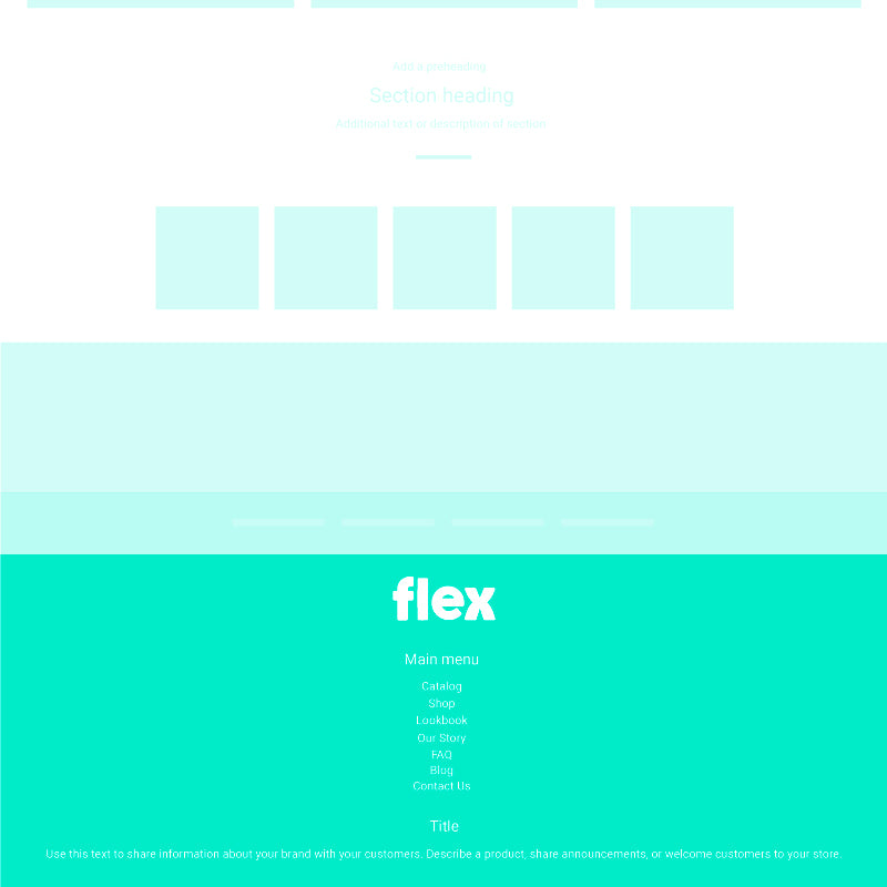

Each footer option (except for “None”) lets you add and configure blocks of content:
- Custom HTML: Exactly what it sounds like — input your own HTML to expand the functionality and look of your footer.
- Logo: This option lets you insert your store logo (or site name). The “Classic” footer layout allows for a line of text under it. This text is a great place to put a tagline, slogan or even contact information or promos.
- Menu: Use this option to add one or more navigation menus to your footer.
- Newsletter: Adds a newsletter sign-up form.
- Text: Add a blurb of text.
- Empty column: Available only in “Classic”, this option lets you create a “spacer” column between content in the footer.
- Social icons: Adds a cluster of links to your social media profiles, with support for Twitter, Facebook, YouTube, Vimeo, Pinterest, Tumblr, Instagram, Snapchat, Houzz, Dribbble, Behance, Flicker and an email address. To activate and link your social icons, be sure to add URLs under Customize > Theme settings > Social media (otherwise this block will appear blank).
The “Promotional” footer option adds settings for a promotional image, text and button linked to any URL you’d like.
In addition, Flex also includes options to toggle the following elements on or off:
- Powered by Shopify (but there are some advantages to leaving it on)
- Designer credits
- Payment method icons (a good opportunity to include additional “trustmarks”)
Within the Footer settings, you can also use custom copyright text as well as add your own custom CSS to refine the look and make any style tweaks.
Icon bar
Flex also adds an exclusive element to the bottom of your site — an icon bar.
This element, which can be controlled by going to Customize > Sections > Icon bar, allows you to add up to six short blocks of text along with an icon of your choice for each one.
Under here, you can control the background, text, link and link hover colors as well as the overall alignment of the icon bar content.
You can also pick from two positioning settings that make a surprisingly big difference — left and centered.
While the left option places each icon inline to the left of the accompanying text, the centered option moves the icon to its own line above the text.
You can also control whether or not the icon bar is shown.
It’s also worth noting that the icon bar is not available if you’re using the “None” footer option.
The icon bar is a great place for spotlight a variety of elements:
- Free shipping messages
- Promotional messages
- Certifications such as organic, gluten free, cruelty free and more
- Unique selling propositions
- Quick feature lists
- “Featured on” type content
You can pick from a variety of free icons for each block.
Using the footer elements
As with most Flex Shopify theme features, the options outlined here present any store owner with a myriad of possible choices and combinations to create effective footers.
Here’s a quick rundown of some tips and things to keep in mind:
- Remember that just because footers are the bottom of the page doesn’t mean they aren’t important. In fact, in many ways, they are your chance for a “last impression.”
- To that end, adding an eye-catching promotion element or using the icon bar to showcase your company is a great opportunity for users who make it all the way down a page.
- If you use either the promo layout or icon bar, keep in mind that the same content appears on all pages, so it typically should be general enough to apply to most or all of your pages. That said, the promo box is also a great way to promote a new or particularly interesting product, blog post or collection.
- Many users may also jump right to the footer of a site when looking for links such as FAQs, customer service, shipping and returns, terms and conditions, and privacy, so it’s always a good idea to make sure you have these links included in your navigation menus, especially if you don’t have room for them at the top of the page.
- On the other hand, a user who scrolls all the way down through your page is also likely to be well engaged with your content, so look at the footer as a sort of “summary” to help make your site look professional and encourage a sale, more engagement, social interaction, or newsletter signup.
- The “Centered” layout may not be the best option if you have a higher count of footer links — because they end up getting stacked one on top of each other. This can end up creating a very high (read: more scrolling required) footer that’s harder to navigate.
- However, if you’re just starting out and don’t have a lot of footer links, the “Centered” option can be a clean and more elegant option. You can always easily upgrade to another footer layout later.
- Similarly, using the “Promotional” option may require some close attention to how much content you add beside your promo box to prevent the footer from being too high, especially in comparison to the height of the promotion.
- Footers, as mentioned above, are also a great place to add trustmarks — whether “traditional” or “non-traditional” ones.
Finally, like Flex’s headers options, the footers do change layouts for smaller screens such as tablets and smartphones, so be sure to preview and test everything on mobile view before going live.