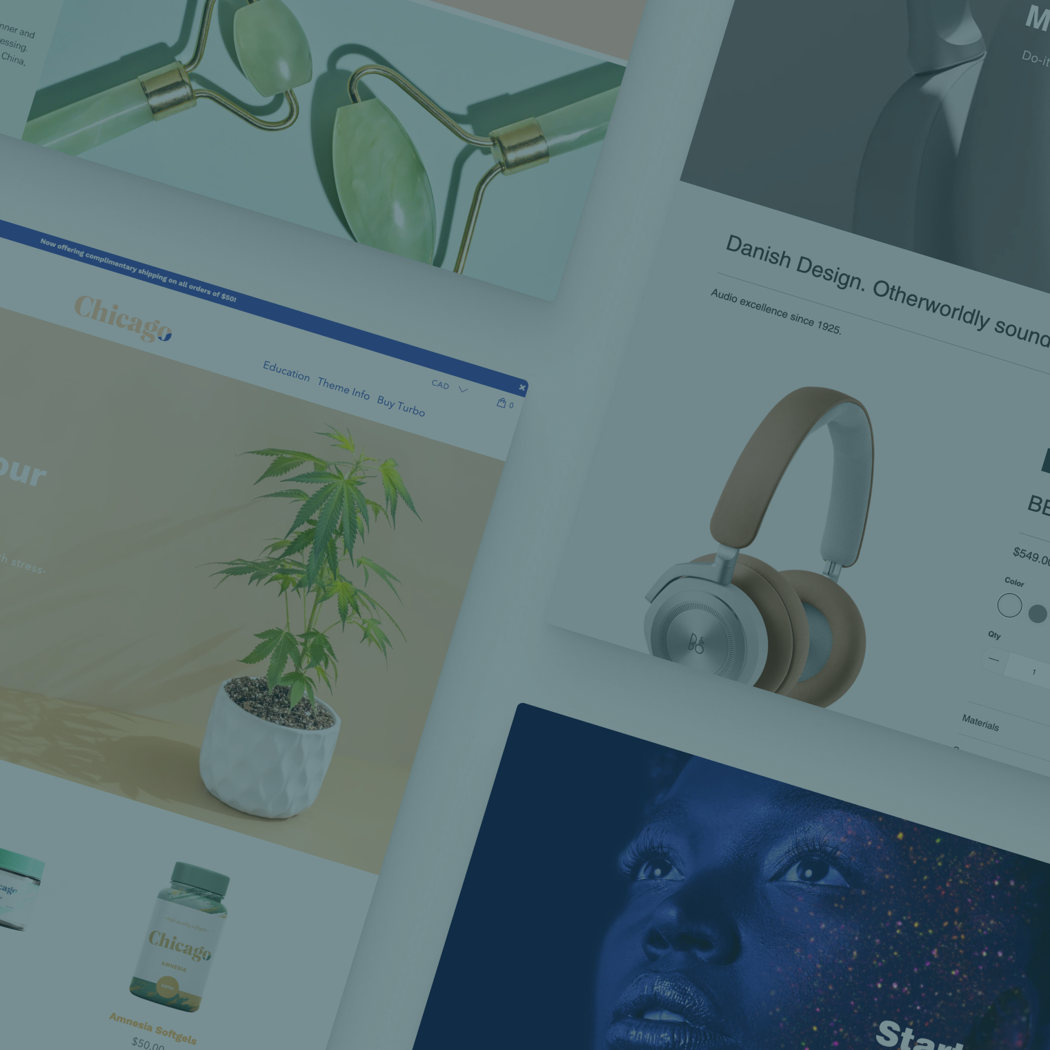

The product page is one of the most important parts of a Shopify theme — it’s where shoppers learn more about the product and, hopefully, begin the conversion process.
While product pages typically need to have basic information such as the product name, price, description and call to action elements, many store owners are finding that offering additional information and eye-catching designs to the product page goes a long way in engaging shoppers and boosting conversions.
That’s why Out of the Sandbox’s new Flex Shopify theme comes with three choices for default product page templates.
To switch up which product template your store uses by default, navigate to Customize > Theme Settings > Layout.
Additional options and settings are under Customize > Sections > Product. The exact name of the section changes based on which option is active.
Once you’ve switched the default template, there is a brief delay while the theme editor applies your selection. We recommend waiting until the preview refreshes with the new layout before attempting to work on any other theme settings.
Classic Shopify theme product template

The classic option, like its name suggests, lets you start with a simple but straightforward product page.
Don’t let the name fool you — the classic page template is still a solid option and includes built-in best practices for user experience and conversion optimization.
It’s always a great option if you sell products that don’t require an extensive explanation or don’t necessarily lend themselves to a lot of photography or other imagery.
The classic option, like the other two options, also gives you control over many elements on the product page, including control the following elements:
- Breadcrumbs
- Product photo gallery zoom to hover
- Product photo gallery navigation arrows
- Product photo gallery lightbox
- Product photo gallery speed
- Product photo gallery transition
- Product photo gallery thumbnail display
- Product photo gallery thumbnail scrolling option
- Product photo gallery position
- Show dynamic checkout button
- Display vendor
- Display SKU
- Display star rating (if reviews app is enabled)
- Display price savings (if item is on sale)
- Display collection names
- Display product type
- Display product tags
- Position of product description
- Standard or wide layout
- Spacing above and below
- Adding custom CSS class names or CSS code
- Sidebar
The classic template also offers limited section functionality that lets you insert a variety of content below the product gallery and form at the top of the product page:
- One or more logo list section
- One or more rich text section
- One product review section
- One recommended product section
Just like other sections, which boast easy to use drag and drop rearranging, you can use these to add additional information, copy and imagery to your product page.
For more details about this template and some important notes, read our help center article on the feature.
Image scrolling Shopify theme product template

This unique new layout option is an ideal way to grab shoppers’ attention with your photography.
Instead of the traditional “slider” style product gallery, users on larger devices will instead see each image, in succession, as they scroll.
The position of the images becomes “sticky” shortly after the user begins to scroll with the “down” arrow or mouse wheel, ensuring that a large image is almost always in view.
The more images you have, the more the user will have to keep scrolling to see all of them — while your product title, description, price, and form still remain visible on the other side.
In a way, the scrolling user interaction essentially replaces the side-to-side image gallery navigation.
One of the key advantages to this approach is that the images “automatically” change as the user scrolls down — which can be a great way to draw shoppers’ eyes to each product photo.
If you’re having trouble picturing how this all works, check out this T-shirt product page from our Moda demo store or eyeglass example in Wink.
You can also use the same section options, mentioned in the classic layout, below your product gallery — so after users have scrolled through all of the available images, there’s more space to continue to explain your product or service.
It’s important to keep in mind that, on smaller devices, this layout doesn’t play nice with narrow screens so images will become stacked vertically instead.
Because of this, you’ll typically want to limit the number of images you use in the gallery so users don’t have to scroll through numerous photos to get the product information on smaller screens.
However, even on smaller screens, the stacked layout, when used correctly, can be a great way to put more emphasis on your product images.
The image scrolling template is typically a good choice for sites with bold, elegant photography or other imagery.
This approach is somewhat non-traditional, so it’s worth noting it might not be the best choice if your potential audience might not understand or feel comfortable with this unique approach.
Our help center article features more details about this template option.
Sections enabled Shopify theme product template

The final product page template is, in many ways, a myriad of default product templates thanks to its direct integration with sections.
In many ways, this template option is similar to the product-details.liquid template available in other Out of the Sandbox themes — but with a new twist: You can add sections above and below the main product information.
Store owners will enjoy the flexibility to add and arrange the following sections in numerous ways:
- Logo list
- Product gallery
- Product information (which includes the call to action buttons)
- Product reviews
- Rich text
- Recommended products
The product gallery, reviews, information and recommended product sections are limited to one section per page.
This product page template also lets you “break out” of the two column design with the side-by-side product gallery and information on larger screens.
If you place the product gallery and product information sections adjacent to each other (which means one is above or below the other in the sections panel), you can still achieve that two column look.
If, however, you opt to place them elsewhere on the page, Flex gives you access to multiple settings to control the width and spacing of the section, as well as apply custom CSS or class names to it.
For detailed documentation about this template option, see this support center article.
A few notes about product page templates
Note that setting the page template option under theme settings will set all product pages to this layout by default, you can still change templates on a product-by-product basis by using these steps.
In addition, any logo list or rich text section created using the sections builder will be the same on all product pages, so remember to keep this content general enough to apply to all of your products.
The product gallery, product information, recommend products, and product reviews sections, on the other hand, are “dynamic” in the sense that Shopify will automatically fill in each product’s unique content for these sections.