

Once upon a time, there were these things called newspapers.
Newspapers would come off printing presses with their ink still damp and go through giant machines that would fold them in half. This made it possible for them to be proudly displayed on racks around town and inside boxes that opened when you put a coin in.
But these newspapers had to find a way to quickly grab the attention of those passing by — so they came up with the idea of ”above the fold.” This led to one of the most talked-about concepts in website design — ”above the scroll.”
Newspapers, which still do exist, of course, are commonly published in two sizes: Broadsheet and tabloid. Broadsheet layouts were taller than they were wide — more of a portrait orientation.
In order to save space on display racks and vending machines (and make them easier to carry around), broadsheet newspapers were typically folded in half at the middle of the longer side.
This meant that any content in the top half of the page was “above the fold” and would be when the newspaper was on display.
Because of this, it quickly became common practice in the newspaper industry to get as many important and attention catching headlines “above the fold” — even if the story continued below.
This was done in hopes that a casual reader might spot a headline of interest and buy the newspaper — and the more headlines you could get above the fold, the better the chance you had of grabbing the interest of a wider range of readers.
Tabloid (the name originally referred to the format, not the content) newspapers are more square or book-shaped — and can generally have their entire cover visible on a rack or vending machine.
Flash forward to the digital age and the word “fold” was replaced with the quasi-rhyming word “scroll.”
Translating paper to pixels
The two concepts obviously differ in that a fold can only be done with physical paper — and a scroll requires pixels on a screen.
The idea, however, is still the same — viewers still see the top portion of a page when a web page, including those built with a Shopify theme, first loads.
If the page contains more content, then users have to scroll down to see it. It’s sort of like an immutable law of how the web works. Because of this, it’s very common to hear people talk about the importance of keeping important content above the scroll on a website design.
At its core, this concept is solid. Naturally, you want to grab users’ attention with whatever content first appears on the screen.
That’s true whether you’re a news site, blog, or online store.
However, it’s also fairly easy to get too focused on “above the scroll” and forget that all that space below the scroll still has value.
Shopify sections and stacking
More often than not, Shopify’s built-in sections feature encourages store owners to build sites that divide content into segments running down the page — which is a key foundation in building pages that are mobile-friendly but also engaging.
This forces us to prioritize content and consider ways that the most important or visually engaging content is what appears first.
Fair warning, it can quickly become frustrating to try to fit everything in above the scroll for mobile devices — but with some careful prioritization and creativity, you can create highly engaging experiences for shoppers:
- Use your best photography or graphics to grab attention
- Carefully craft headlines and other text that’s catchy and grabs attention — but also leaves the shopper wanting to learn more
- Use call-to-actions (CTAs) to encourage users to engage
It’s tempting to use gorgeous, full-width content that takes up most or all of the height of the browser window too, but allowing some of the content below to “peek up” above the scroll is a simple visual cue that there’s more to see on the page.
As you continue down the page, you’ll want to keep two key points in mind: Priority and presentation.
We’ll look more at presentation next week, but for now here, let’s explore how prioritizing strategies help build your pages.
Prioritizing content
Priority involves placing the more important content (or content more likely to convert customers) higher up on the page.
- Before you start customizing, think carefully about what content you want on the page.
- Consider using scrap paper or sticky notes to represent each section of content and then move them around as you consider what should go where (or, if you prefer, you can do this digitally with a mind mapping or drawing tool or even right in the Shopify theme customizer).
- As a priority begins to emerge, think about how your potential audiences might approach the content and if the order is meeting their needs.
- Also consider flow — are you introducing content in a way that makes sense to someone who might be considering buying?
- Once you start building your page, you can always use the drag and drop feature to move things around the page and see how it affects the flow of your page.
Ultimately, your goal with prioritization should be to get shoppers invested higher up on the page.
This is true for almost any type of page — whether it’s a Product page, About Us page, or even more mundane ones such as policies and return information.
Show how your company, products, or services can solve a problem, make people’s lives easier or just how awesome they look.
- Start with your strongest features or unique propositions that stand out — this can include not just your products or services themselves, but also aspects such as your customer service, guarantees or free shipping.
- As you gain “buy-in” from shoppers, start adding additional information or more details about the main ideas you’ve introduced to continue engagement.
- Finally, finish out the page with the more nitty-gritty details and other information that, while still important, might not be the first thing shoppers are looking for. This is also a good place to add any “fine print” you might need regarding your policies.
Product pages
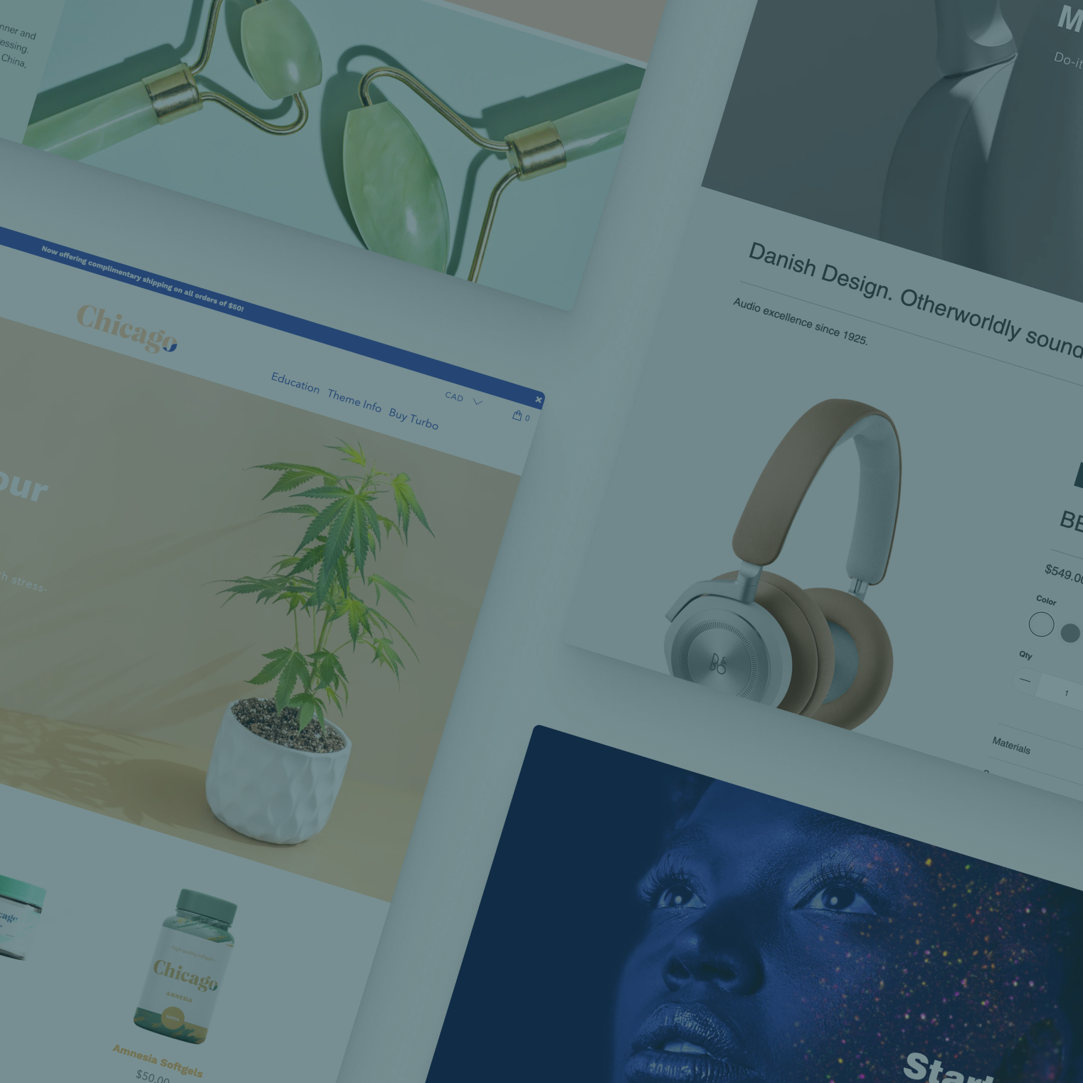
With the Flex Shopify theme, store owners and designers now have the ability to add content above the standard production gallery, information, and form using an alternate product page template, which opens up interesting possibilities for product page design.
Many successful ecommerce stores are shunning the traditional product page layout in favor of using imagery and text to present their products or services, gaining trust and buy-in and then including the “add to cart” area:
- This often lets you showcase product photography and imagery better than in a traditional gallery.
- Likewise, you can often more effectively use text headlines to grab attention and explain your business.
- You can use more advanced layouts to create more engaging product descriptions that go beyond just blocks of text.
- It’s easier to include trustmarks and other elements that can help conversion.
Product pages using this approach also have the advantage of feeling less “in your face” about being a sales pitch. Instead, shoppers are encouraged to get to know the product or service — the digital equivalent of picking up an item, examining it and seeing if you like it.
Of course, there will always be stores that still benefit from the traditional layout, so if you do try this approach it’s a good idea to closely monitor conversion rates after it goes live.
Even if you don’t (or can’t) use the more advanced Flex product page layout or find it doesn’t work for your store, consider moving that content below the gallery and product form.
Despite it not being the first thing users see, savvy online shoppers often treat that “above the scroll” content as more of a summary and look for more detailed information, images and more below.