

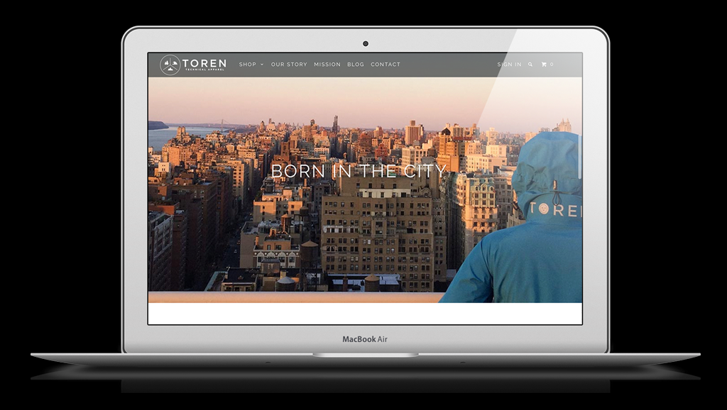
One of the most popular features of Shopify themes is a homepage banners — but how do you make this increasingly common feature work for your store?
The homepage banner, sometimes also referred to as a imageshow, hero, slider, rotator or carousel typically features two or more large, dominant images that are one of the first elements a visitor sees when entering your site. Often they will feature animation or cross-fades when changing from one to the next.
But what exactly should occupy that big, important space on your homepage? Here are some tips, ideas and suggestions to consider:
Picking photos
Choosing the best photography is the logical place to start when considering options for your homepage banner, considering so many of them feature photography or other imagery as a base.
First, it’s important to remember that whatever image you chose, it should be able to maintain a clear, sharp look even at very large sizes, since homepage banners often automatically expanded to fill the entire width of the user’s browser window.
For subject matter, you’ll likely want to avoid images that are overly complex or cluttered.
Clean, simple product shots with solid color or blurred backgrounds can be a good choice for this type of application.
For a more creative spin, consider using extreme product closeups that show off your products’ quality or even a solid color or interesting pattern or background design that relates to your products or brand. If taking your own photos, consider a free stock photography site.
Finally, also be sure to consider how your image will look on mobile devices and tablets, especially in relation to any text that’s being overlayed. Some premium Shopify themes, such as those available from Out of the Sandbox, also allow the option to specially crop your imageshow background images on small screens.
Many Shopify themes also offer the option to include a video in your homepage banner. This eye-catching method is a great way to add another dimension to showcasing your products, but it’s also important to keep in mind the same points above about photos when picking a video (find out more on how to configured video in Out of the Sandbox's Parallax Shopify Theme or Retina, Responsive or Mobilia Shopify Theme).
Often the best option for videos is to buy an inexpensive stock video — these are typically well produced and some even are shot with their use in a homepage banners in mind, so look for ones that already have good negative space and contrast while providing a clean look.
Crafting text
Including text in your homepage banner can be an effective way to complement your photography. However, it’s important to make sure, when selecting an image, that there’s is adequate negative space for placing the text.
The dominant colors of the photo should provide enough contrast so that the text remains readable, as well.
Finally, when writing your text, it’s often best to keep phrases short and simple. A few carefully chosen words that add a bit of intrigue or curiosity can also be very effective. Also consider how you can break up text into headlines, subheadlines or the other elements your Shopify theme allows.
The best content
When considering your homepage banner images as a whole, there are two distinct approaches: Using the area as a promotional tool or using it as a storytelling one.
The promotional approach involves using the homepage banner to spotlight specific products, sales, specials or other content on your site. Often this content is changed frequently to prevent the site from becoming stale.
For stores with value-conscious or price sensitive customer bases or frequent new inventory, this approach can be an effective way to draw in users to delve deeper into your store.
Keep in mind, however, that using your homepage banner for this purpose often requires more frequent changeouts to prevent users from getting tired of seeing the same items, as well as because content will likely naturally become outdated.
On the other hand, some types of stores may find it more effective to use the homepage slider to tell the story behind the company and products. This can quite effectively be divided up into smaller segments, perhaps three to five, each with its own slide in the rotation.
For this approach, it’s best to break down your story into manageable segment and introduce a single idea or segment at a time, each with well crafted text and carefully selected image.
Including calls to action
The final element of an effective homepage banner is ensuring that each slide has a clear and well chosen call to action — typically a link or button. Although many Shopify themes give you the option to not have a call to action on one or more of your images, this can often be a mistake since users often equate homepage banners to being clickable.
It’s equally important to consider where you will send users when they click the call to action button or link. In the case of a slide promoting a sale, then most likely the best place to link to is the collection featuring the items.
It can be a bit trickier, however, to identify the best place to send users when a homepage slider takes on the storytelling approach. One effective technique is to link the user to a page that gives more detail about the aspect of the story in question.
This is a great way to provide more detail to those who want to know more about the subject of the slide (especially since your space is limited in the actual slide) as well as show more photographs.
It’s also fine to integrate links to relevant collections or products on this secondary page — and this technique can be especially effective in keeping the funnel slippery and slowly but effectively introducing potential customers to your brand and products.
Alternatively, you could also link the user to a collections or product page.
It’s also important to carefully word your link or button so users know exactly what to expect when they click. If it’s more information about a product, “Learn more” is a good option. For links to product pages, consider “Explore all items” or something similar.