

Besides being the name for the newest of Out of the Sandbox’s premium Shopify themes, parallax is also a broader term used to describe a popular visual effect in website design.
In Web design, parallax effects, often referred to as parallax backgrounds, create the illusion that the background photo or graphic on a page is moving at a different speed then the user is scrolling.

Parallax has emerged as one of the most popular visual effects with Web designers today — mainly because of its ability to add an added sense of depth and dimension to what users view on computer screens.
Parallax backgrounds, however, do more than just look cool and trendy. They’re also a great way to showcase your products and services.
Connect with shoppers
The use of photographs showing your products in use or on display is always a great way to illustrate usage and help shoppers build a connection to the items. This is technique many online store owners already use and parallax images further enhance the user experience by mimicking how we see things in real life.
For example, when someone is shopping in a brick and mortar store, they aren’t limited to just looking at a product in a single rectangular space and at a single angle.
Of course, this type of interaction isn’t possible on websites without advanced 3D rendering software, but parallax effects do a great job of creating the illusion that shoppers are viewing products from a changing perspective, much like they would in a store.
Picking a parallax background image
When selecting an image to use as a parallax background, there are a few points to consider:
Standalone or not?
Parallax backgrounds can be a standalone image or add text on top of it to give the viewer more details. A standalone image can be an effective way to elegantly showcase a product, while adding some text, even if it’s just a few words, can give valuable added context to what the user is seeing.
It’s a good idea to experiment with different configurations until you find something you like. A good rule of thumb, however, is to consider what someone unfamiliar with your products would think when seeing the image — is it clear what the item is by itself or would a few words help explain things better?
Even if your product image is completely obvious, words can also be used to incorporate your marketing slogan, highlight not-so-obvious features or create a mood or tone that helps build a connection with your audience.
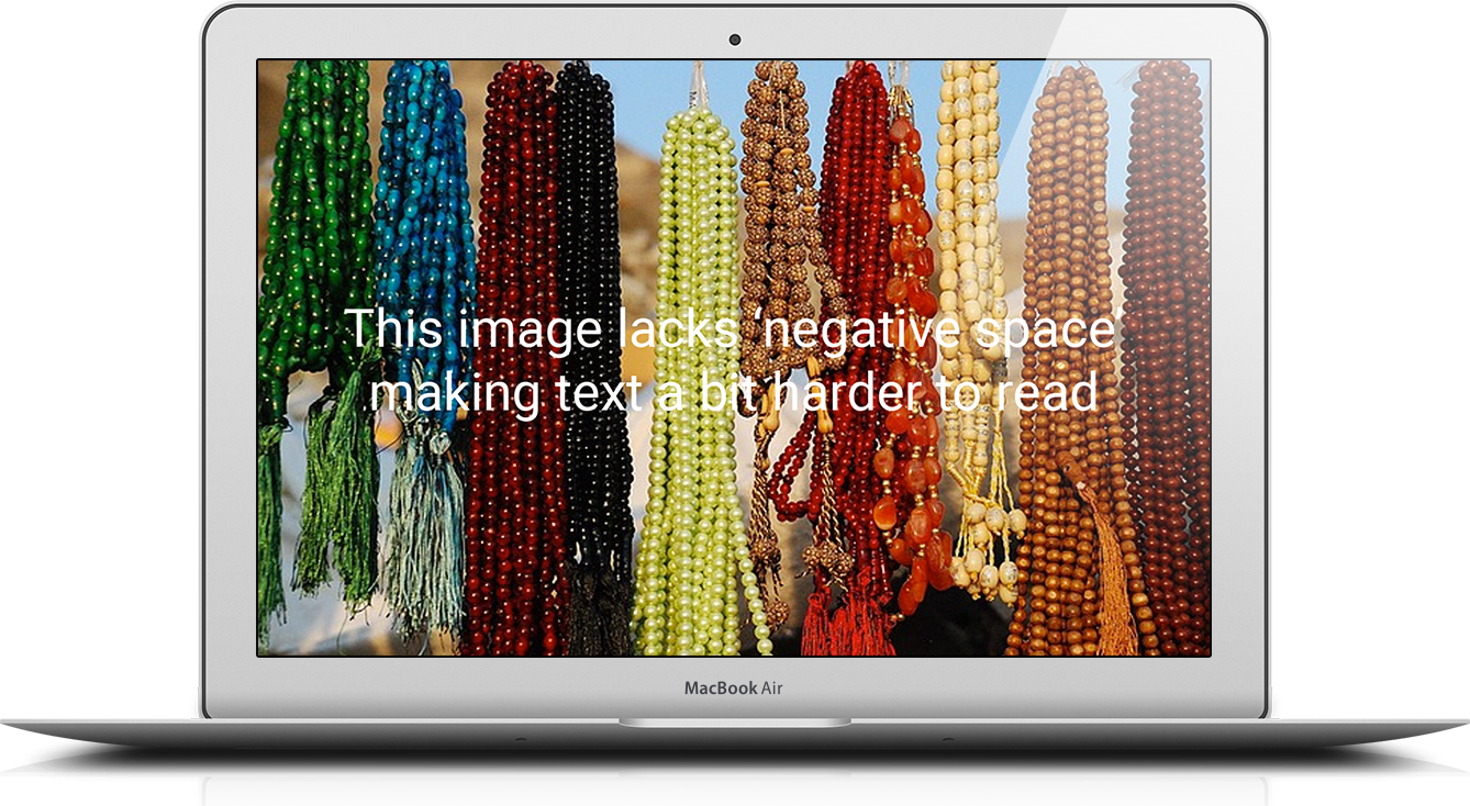
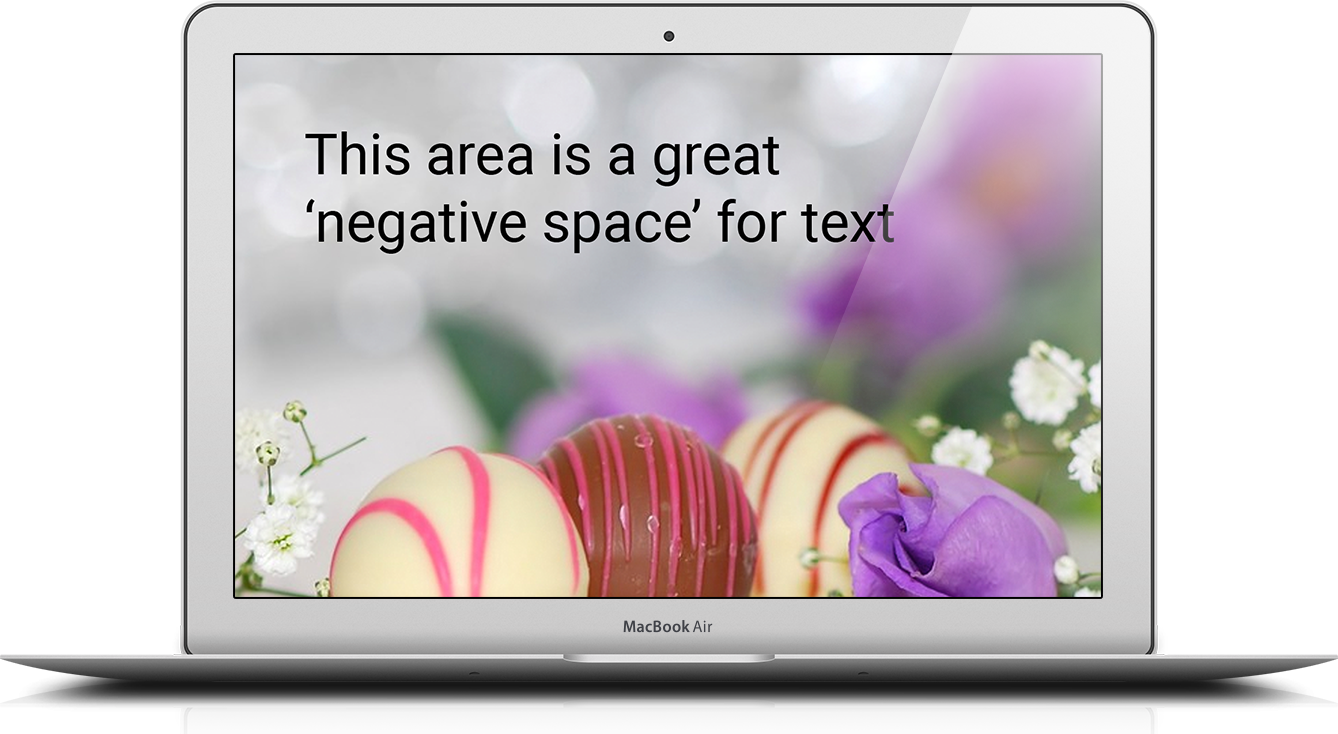
Negative space
If you do opt to have text overlayed over your parallax backgrounds, it’s important to consider how that text will be placed and, when looking for an image to use, keep your eyes open for ones that have negative space that can be used to accommodate your text.
Also, don’t forget that parallax backgrounds aren’t limited to just photos. They also work great with patterns or illustrations.
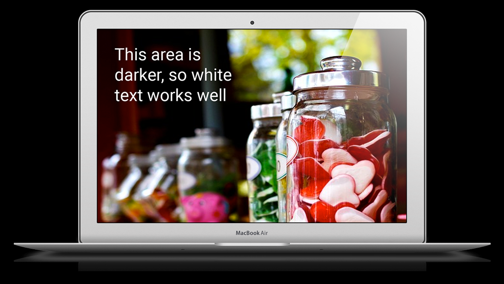
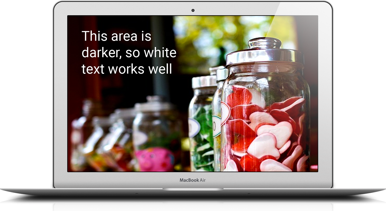
Light v. dark
If the text you’re using over the background is lighter, it’s generally best to pick an image that’s darker and vice-versa. Keep in mind this doesn’t necessarily mean “darker” in the sense of being a somber shade of black, blue or brown — you just need to look for images that are dominated by richer hues.
Likewise, if you prefer dark text, then look for an image that’s on the lighter side (think pastels). If text color isn’t important, consider finding an image you like first and then letting it dictate whether the text is light or dark.

‘Spots’
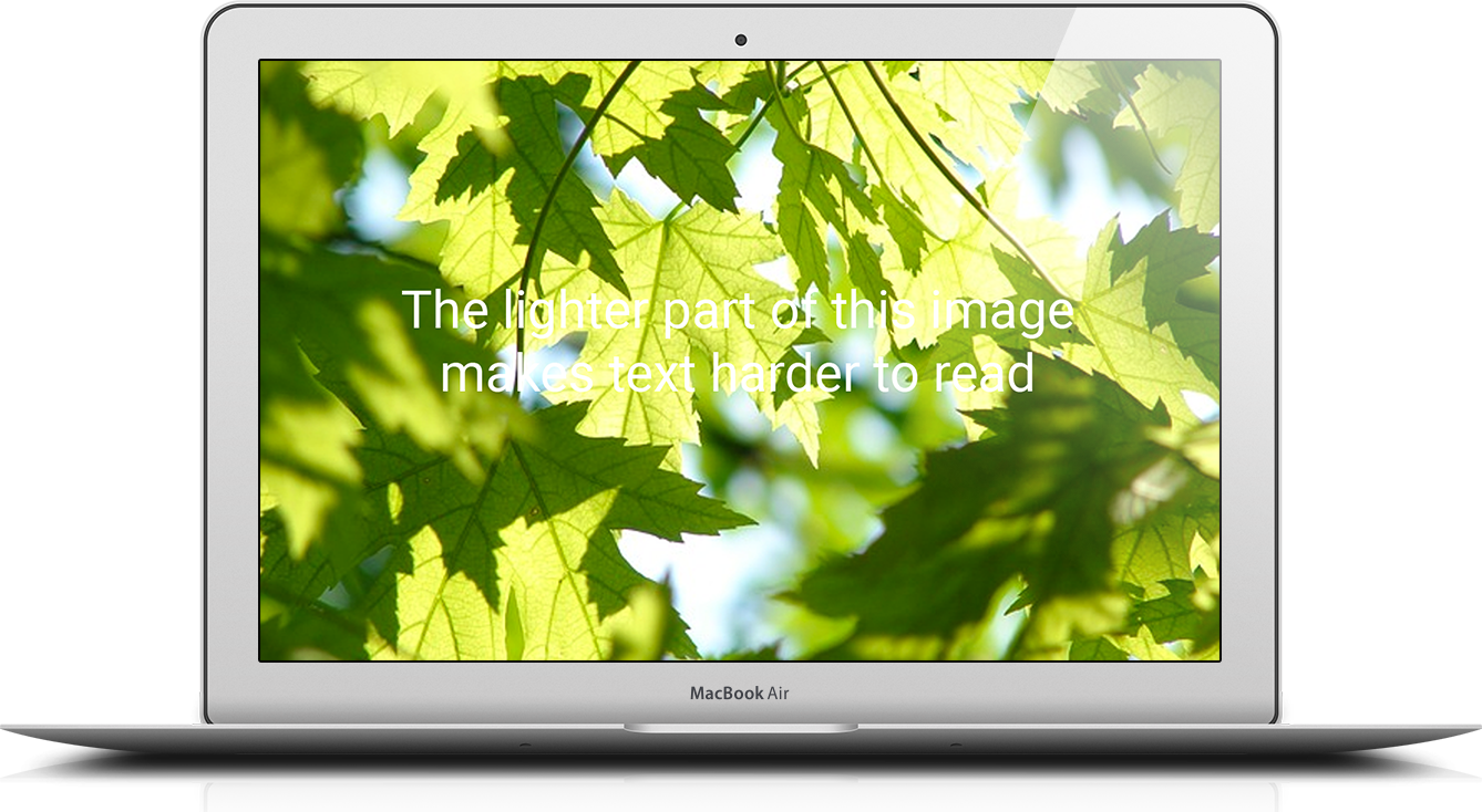
One thing to consider when selecting an image is if it has any “spots” in it. For example, in this photo of tree leaves, there are parts where the lighter tone of the sky behind the leaves might make it difficult to read lighter-colored text placed over these areas. This can cause letters to “disappear” from words, making it more difficult to understand your message.
Although the Parallax theme adds a subtle outer shadow to text to help remedy this, it’s still worth double checking that your text remains as legible as possible.
Responsive issues
It’s also important to check where your text ends up being positioned when a browser window is adjusted to be wider or narrower. This can drastically affect the legibility of your text.


Image quality
You’ll also want to make sure you save any image backgrounds at large enough sizes so that users with big screens don’t see significant degradation in image quality — which often causes images to look “blurry” or “pixelated.”
Fixes for common parallax image background problems
Of course, the larger the image file the more time it takes to download, so it’s often a fine balancing act of finding the perfect mix of image dimensions, quality and file size that works best.
In general, JPEG images are better for photo-style backgrounds and result in smaller file sizes. You can also try adjusting the quality level (try 80) to see how the integrity of the image resolution is affected.
For image dimensions, a good size range that’s used by many prominent sites is in the 1600 to 1800 pixels wide range. This will allow the image to be displayed a full quality for most users while also maintaining a reasonable image size.
It’s also worth noting that many users are accustomed to seeing slightly blurred background images. Even just a slight blur can actually remedy a lot of the issues we’ve mentioned above and also give you some “wiggle room” when it comes to image size versus quality since the viewer’s eyes are “tricked” into thinking the image supposed to be blurred.
This effect, when used correctly, also can give your Shopify site a softer look with a bit of added depth and dimension. You may also want to experiment with more extreme blurring effects on all or part of your background photos, which can result in some very interesting color patterns that, even though they aren’t clear, still give a hint of what’s in them.

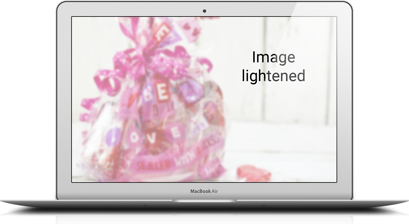
Finally, another option is to use a photo editing program to lighten or darken the image you’ve selected so increase overall eligibility.
In the Shopify Parallax Theme
Out of the Sandbox’s Parallax theme, as its name implies, is equipped with out-of-the-box parallax background sections on the homepage that only require you to upload an image.
The Parallax Shopify theme lets you specify up to six parallax background images on the homepage, each with its own background image height, color and text alignment options. You can also toggle on and off the Parallax effect for any of the sections for a bit of variety.
Each section can also have a clickable button to draw shoppers deeper into your site and the flexibility of the theme is further enhanced by the ability to set specific the exact order you want each background to appear on the homepage along with the other configuration sections.
To access these options, simply navigate to the “Themes” section in your administration area and click the “Customize Theme” button in the upper right. Then select the homepage from the right hand menu and use the preconfigured fields to customize.
