Since joining the Out of the Sandbox Shopify theme family, Parallax has quickly become one of the most popular themes we’ve produced.
Packed with tons of advanced features, including built in support for color swatches, “coming soon” product signups, configurable sidebar, email newsletter signup form and an infinitely flexible homepage, the theme gives shop owners a plethora of options and features that would normally require hours of custom development time.
This week, we’ll be taking a look at Parallax-powered Shopify sites and how they’ve used one of the many features available in this great Shopify theme to enhance their shoppers’ ecommerce experience.
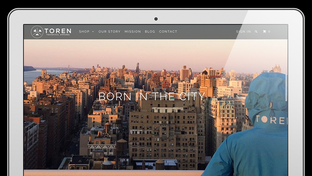
Toren Technical Apparel, which sells direct-to-consumer outdoor wear, uses its implementation of the Parallax Shopify Theme to not only sell its products, but also to clearly communicate its story and mission to website visitors.
The Parallax Shopify Theme’s long form homepage gives Toren plenty of space for elegant, eye-catching storytelling as well as places to showcase its products. Through the use of stunning full width photography of its products “in the wild,” the page draws in users with relatable imagery.
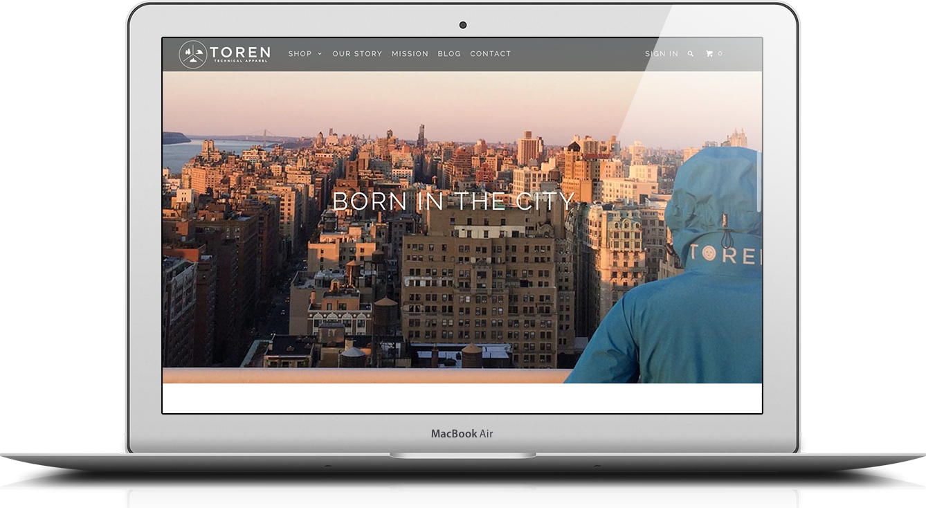
By making use of the Shopify theme’s built in and namesake parallax image features, the homepage gives users an ever-changing shift in perspective as they scroll down the page and become more engaged with the brand, a viewing experience that’s not unlike how Toren’s customers explore the outdoors and its rich, dynamic landscapes.
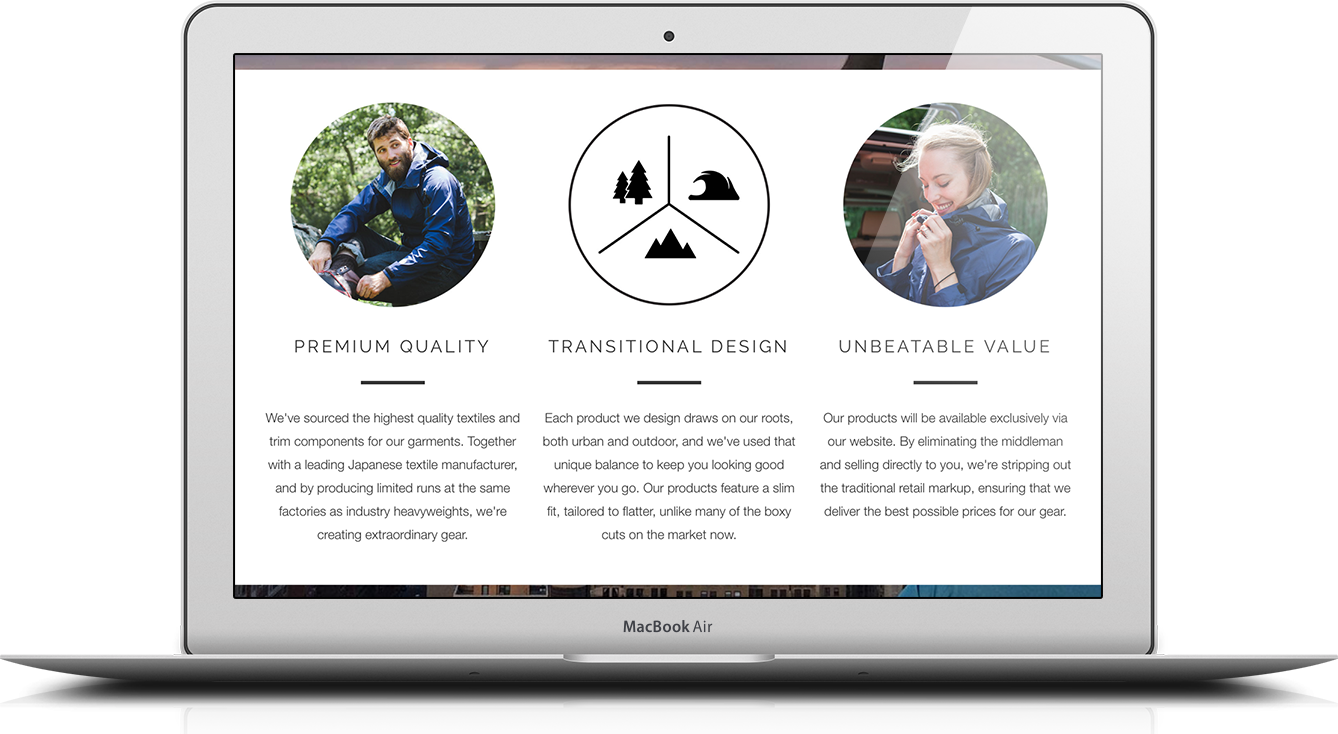
In addition, the Parallax ecommerce theme also allows Toren to integrate clear, easy to read text blocks accented with circular photographs that clearly explain its products and company. Other layout options include product grids, social media feeds and even pulling content from other areas of your Shopify site.
To further drive home the flexibility of the homepage, Toren also incorporates a beautifully produced product intro video (that’s controllable via the Parallax control panel), as well as a row of featured products that’s cleverly introduced toward the bottom of the page — a great strategy to increase conversions by grabbing shoppers’ eyes once they’ve already become fully engaged with the site.
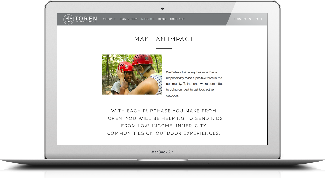
Elsewhere on the site, Toren uses clear typographic and photo layouts to explain its story and the support purchases lend to introducing inner city children to outdoor exploration.
Tomorrow we’ll take a look at how the Parallax Shopify theme’s built in support for color swatches and real time image updates helps a watch retailer showcase the multiple options it offers.
Series Roundup
You're reading the first in a series of five posts, each focusing on a specific feature of the Parallax Shopify theme. Learn more about the theme and its features in the other posts in this series:
- Day 1 (this post): Parallax Shopify theme feature spotlight: Storytelling on the homepage
- Day 2: Parallax Shopify theme feature spotlight: Color swatches
- Day 3: Parallax Shopify theme feature spotlight: Email newsletter form popup window
- Day 4: Parallax Shopify theme feature spotlight: Sidebar options
- Day 5: Parallax Shopify theme feature spotlight: Sold out and coming soon products

