
Turbo, the latest premium Shopify theme to join the Out of the Sandbox family, already lays the groundwork for a great store design — but the theme’s plethora of options makes it easier than ever to create an almost limitless number of unique looks.
Last week, we discussed some of the settings and configuration options in the Turbo Shopify theme that let you break out of the mold.
This week, we’ll take a look at some more advanced ways that Turbo can be used to create exciting page layouts and designs.
Use full width images on product pages
One of the popular strategies in Web design for online stores is to create longer, more detailed product pages that provide full information about the product along with imagery to further illustrate the item.
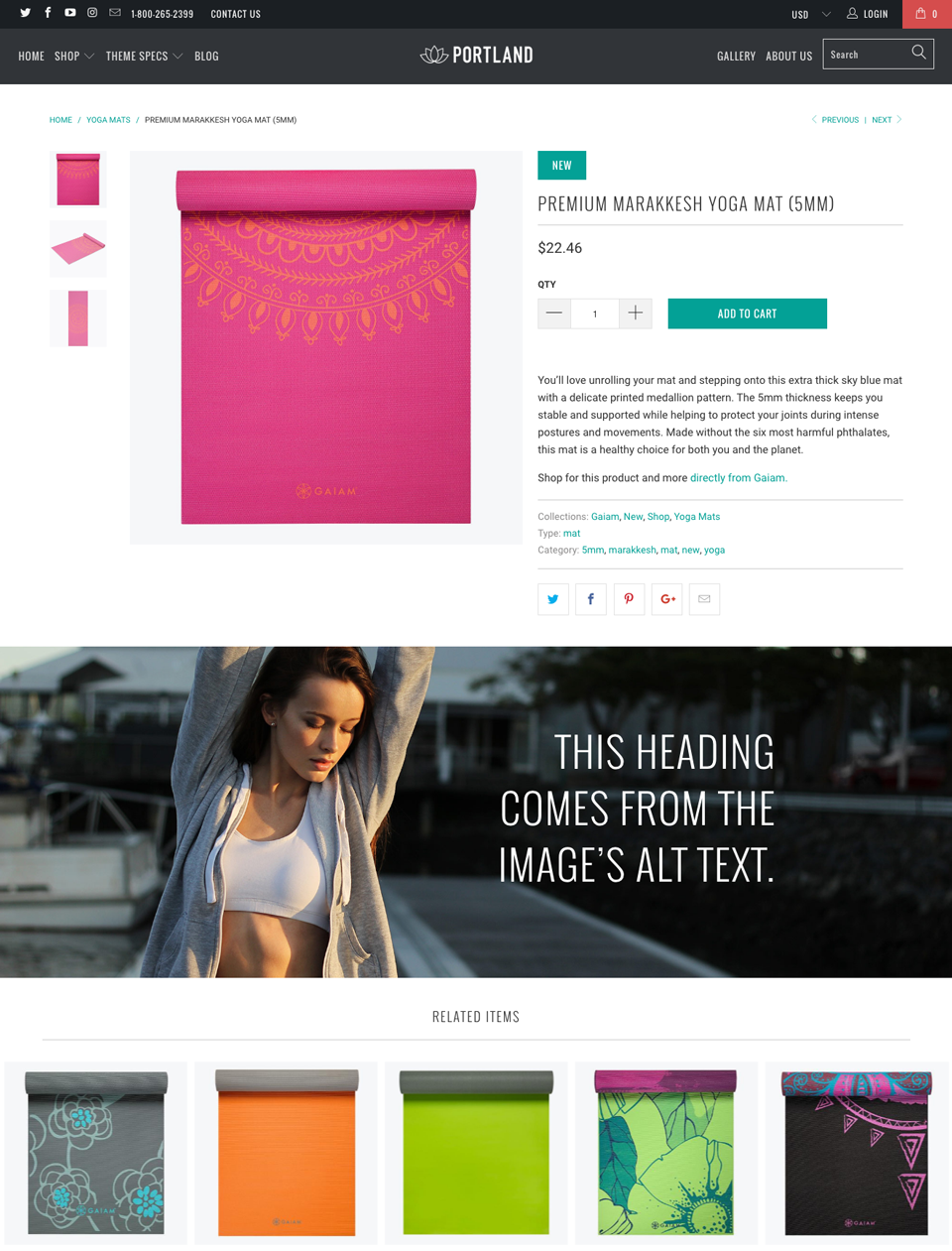
Out of the Sandbox themes all feature a way to add additional content below the product description and image gallery using a special “split” tag, but Turbo adds an exciting new feature that lets you insert full width banner images on your product pages, complete with a text headline.
This feature is a great way to make your product pages even more eye-catching without having to customize the code.
Use columns
Columns are another great way to create unique layouts and designs for your product pages, as well as within any other place you can enter content — such as collection descriptions and standalone pages.
More details about using Turbo’s built in column framework is available here; and here are some tips on how to use columns to create eye-catching designs.

- To clearly and concisely call out features of your product, try using a two column layout after the “split” tag. Then, in the left column, insert an image or icon that illustrates the feature. On the right column, add a short heading and a sentence or two about the feature.

- A variation on this technique is to create multiple columns and start with an icon on the top of the first column. Then, add a heading or text under it.

- To showcase additional product photos, try creating a multiple column layout of three or more columns, each one with a separate image. You can also use a little CSS magic to crop your photos in a circular shape or use other special effects to make them stand out even more.

- Divide your content into sections be creating a full width (16 column) row with just a heading in it. Be sure to use an “omega” tag and then two or more columns below this. Then, repeat this as you go down the page, ensuring that each row of columns has an “omega” tag on the last unit.

- For a more contemporary multi-section layout, trying placing your headlines in a column on the left and the section content in a separate column to the right. Depending on the exact length of your headline and other content, you may want to experiment with making one column larger than the other.

- Two column layouts are a great way to compare your product to either a competitor’s or another model you carry. Give each column a heading with the product name and then use a bulleted or numbered list to offer a point-by-point comparison. If you’re comparing more than just two items, add an additional one for each model.
- Remember you don’t need to use the same column grid for all of your content. For example, you might want to present a row of six images in smaller columns, then jump to a two column layout to compare your product with a competitor's’ — then jump to a three column icon-based layout to spotlight other features.
Experiment with homepage sections
Turbo comes packed with tons of homepage sections and with that comes an almost infinite number of combinations for your homepage design.

- Featured promotions: These square shaped boxes can run full width or be centered on your page. Each option creates a unique look, so experiment with both to see what works best for your store. You can also choose to feature up to eight separate boxes and control how many promotions should appear per row. These settings can be “mixed and matched” to create more interesting looks.

- Featured links: This section of the homepage lets you link to collections, products, blog posts or other content by using a navigation menu. Turbo also lets you select from two unique layout options: one or two links per row.

- Featured collections: Turbo offers both a slider and grid layout for featured collections on the homepage — and you can use a different style on each collection for an even more varied look. Both features also let you select the number of products per row or per slide. Try experimenting with different options to see which best showcases your products and works with the rest of your site design.

- Featured collection in detail: This feature, which is also included in other Out of the Sandbox Shopify themes, lets you sell products directly from the homepage with all the details shoppers need to take action. Change the look by staggering the layout or hiding the product description.
When setting up homepage sections, don’t forget you need to activate them. Also keep in mind that you can easily move sections up and down the homepage as well — and experimenting with different arrangements is a great way to discover a unique look for your store that engages customers.
Try, and try again
Again, one of the best ways to take advantage of all these options is to experiment with the settings and code. It’s often surprisingly easy to stumble across a unique look you wouldn’t have imagined was possible.
These types of changes also have the advantage of not requiring modification to the core theme code, making it easy to keep your theme up to date with our exclusive Shopify Theme Updater App.