
While full width banners and sliders are some of the most popular features on Shopify themes today, these can also be challenging to manage from a design standpoint.
Because the image used needs to be able to expand or shrink to accommodate a virtually infinite number of screen sizes, there’s very little precise control over how the image is positioned, cropped or scaled — or how the text on top of it is positioned.
Image selection
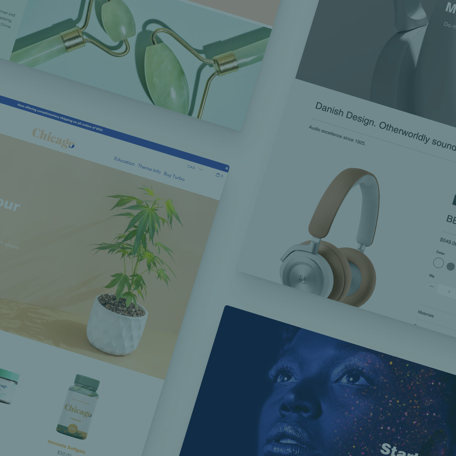
When considering images to use in full width banners, it’s typically a good idea to avoid images with a specific focal point and instead think of your image as more of a background.
For example, a photo of your product as a focal point can be problematic for two key reasons:
- First, in most cases, your shoppers need to see the entire image, without any cropping, at a specific size for it to showcase the product clearly and not cut any important bits off. Because it’s difficult to fine-tune how the image appears at all screen sizes, there’s no guarantee how it will end up looking to specific users.
- Second, the positioning of any text you chose to display over the image may look great on a particular device or screen size, but could cover up the image or become unreadable at another.

While the images you select don’t necessarily need to be a background image in the traditional sense of something abstract or a repeating pattern, images that don’t require the key focal point to be visible do tend to work better.
A good way to generate ideas for this type of image is to start thinking about your product line and then “take a step back” and think about the imagery and environments that are associated with it, in terms of lifestyle or use contexts.
For example:
- Outdoor gear stores: A panoramic landscape photo.
- Jewelry stores: Close-up photograph of the beads, gems and other materials used to create the items for sale or a creatively framed shot of someone wearing the jewelry.
- Clothing or leather goods: You might use close-up shots of fabrics or leather or, going the opposite direction, a wide view of your brick-and-mortar shop (if you have one) or images of people using your items in everyday life.
All of these images have a key characteristic in common — they can be viewed at almost any size, cropping or positioning and still make sense to the shopper. In many cases, even if the user can’t make out specifically what the image is, especially on mobile devices, the general mood and theme of the image will still show through.
Think thematically
Also keep in mind that the images you use don’t necessarily have to be product-related. Consider everything from your store name to the brand image or tone you want to convey when selecting or taking photos for your shop
For example, if your store products or brand is related to a sense of serenity, such as might be the case for a yoga shop, you could use images that convey a sense of calm such as a seascape, raindrops or candles.
These themes can also be conveyed with patterns or extreme close ups. For example in the serenity example above, a close up of sand, shells or waves could also be good choices
Beyond photos
Also keep in mind that you’re not limited to just using photos:

- A solid color, especially one advertising a sale or special, can actually be more effective than a photo, especially if it’s bright or in high contrast to the rest of your site, as shown above. This option virtually eliminates the issues of image scaling. Note that in some themes, you may need to create a solid color image to achieve this effect.
- Similarly, a textural background with an interesting pattern can also work well. For example, if you’re promoting a holiday sale, use a subtle snowflake or holly pattern (just make sure the pattern isn’t too ‘busy’ if you plan on adding text over it). Or, if your store sells shoes, consider a subtle footprint or line art version of a shoe, as shown below.

Fine-tuning your images
No matter what images you end up selecting, there are some small but effective edits you can consider to make them work better in full width banner or slider applications:
- Consider adding a dark or light screen or overlay over the image to add a bit more contrast. This will make text easier to read and also cut down on visual clutter a bit.
- If your background is more scenic or textural in nature, adding a slight blur can also have a similar effect.
- Pay attention to the aspect ratio of your image as well; for a more “long and narrow banner” effect, make sure the image is at least three times wider than it is high; for a larger, blockier image that occupies more of the screen real estate, keep the height and weight roughly equal, or a maximum 2:1 ratio.
Text challenges
In many cases, you’ll want to display text over your full width banners in order to add a bit more context or a call to action, both of which are great strategies.
Keep in mind that precisely positioning the text typically requires custom coding and it can be quite challenging to accommodate all the various screen size scenarios.
By using the background-style image approach discussed earlier in this article, the positioning of your text becomes less important — which ultimately means your design is more flexible.
However, there are some things to keep in mind:
- Keep text short: This helps let your image stand out as much as possible and improves readability, especially at smaller screen sizes.
- Don’t use long words: Be sure to test your site on mobile devices or simulators to make sure that any longer words you use don’t break your layout. A common issue is that longer words can’t fit on a single line, so they may wrap onto multiple lines and end up breaking the layout.
- Don’t add text directly to your images! If the images crop at smaller sizes you may lose essential info and it’s also better for SEO to keep any text as actual text.
- Anticipate the alignment of any text you’ll have and create space for it in the image accordingly (e.g. if you envision a left-aligned header and subheading, consider off-setting the image to the right or blurring or darkening the spot under where the text will go.
Test, test, test
No matter what images and text you select, it’s vital to test at a variety of screen sizes.
A quick and easy way to do this is to grab the right side of your browser window and click and drag to resize it smaller and wider (it’s also a good idea to refresh the page at each new size you preview) . As you do this, keep a close eye on how things reflow and how the layout is affected.
This approach can be a good test because you’re viewing your site at many different screen sizes — and not just the popular ones. As desktop and laptop screens get larger, it’s important to keep in mind that many people don’t keep browsers full screen anymore.
In most cases, you can use this same method to trigger how your site will look on mobile devices — in both portrait and landscape.
However, it’s also a good idea to view your site on as many different devices as possible and use different browser and operating system combinations just to catch any irregularities.
Alternatives
Unfortunately, if your design ends up requiring precise control over the positioning and cropping of full width banner or slider images, you will likely need to invest in some custom code that accommodates a wide variety of screen sizes and device types and orientations.
Though this may seem simple, it can end up being quite extensive and costly (plus customizing themes comes with its own set of headaches), so it’s always best to consider alternatives first.
Some themes with full width banner images do offer a “crop mobile banner images” option that gives you a different way to display the imagery on smaller screens, rather than just scaling the full image down in its entirety.
It’s important to note that this isn’t foolproof either though, since there is still a lack of precise control over exactly where the theme will auto-crop the image at various screen sizes. Again the best bet here is to follow the tips above for using images without a main or crucial focal point that will look odd if it gets cropped a certain way, like cutting off part of a model’s face or the essential part of a product image.