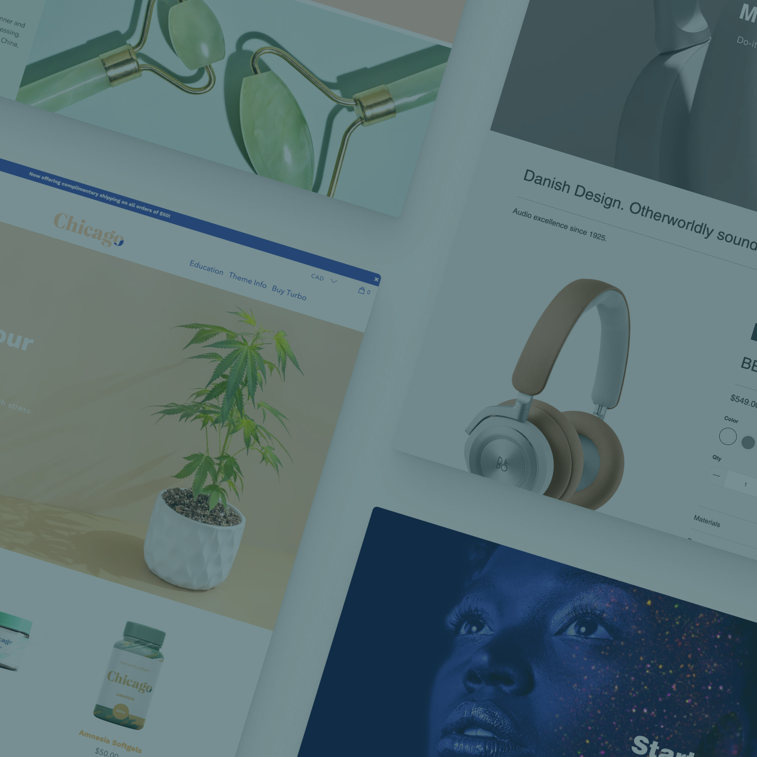

Along with a new style preset, Chicago, and some other great new features, version 2.2 of the Turbo Shopify theme also introduced a new type of section: Text columns with images.
Like its name suggests, this new section lets you create an area on your Shopify store’s homepage that features a mix of image and text content in a column layout — without having to write custom HTML.

This new section allows you to have up to five columns per section, with the following features and options:
- Above the row, you have the option to include a text header, or you can leave this field blank to not show the headline.
- The column layout becomes responsive automatically, becoming stacked on smaller devices.
- Each column can feature an optional image.
- Each column can have a heading in either regular or large size.
- Columns can feature a block of text, which can be left, center or right aligned.
- The columns can have a clickable button with your choice of text, making them great for CTAs or promotions.
- Finally, each column can have an optional border applied to it, in either “boxed” or “quote” style.
Since you can vary both the content and number of columns, this section opens the possibilities to create a variety of different layouts:

- One of the key concepts to keep in mind is that each column can have one or more of each of the elements — an image, heading, text or button — but it does not need to have all of them. This lets you delineate sections of your design and create a myriad of layout combinations.

- The height of your columns will grow to accommodate the content in each one; so if you want all column heights to be consistent, you’ll need to manually make sure each column is roughly the same height by adjusting your content. However, the use of negative space with unequal column heights also has some interesting design possibilities.
- Keep in mind that as you add more content, the images, if used, will become smaller on desktops and tablets. Any text content will also take up more vertical space.

- By “mixing and matching” you can create a wide variety of layouts that can be used for many different purposes, such as calls to action, promotions, blog post teasers, links to featured products or collections and more.

- Use the border options to call extra attention to a column’s content; the boxed style will highlight a whole column with a border around all edges, while the quote style will add a border to one edge only. Use this as a ‘divider’ between columns, or pair it with some large text to create an editorial style heading.

- You can also experiment with alignment and text size options to create interesting typography-based designs.

- It’s also possible to combine several of these sections to create multiple “rows” of content that, when combined, create a single block of eye-catching content.

- In addition, you can also use this section to create a simple “one column” row that occupies most of the width, if you don’t want or need multiple columns.
