
In the world of ecommerce store design, many Shopify themes tend to favor using a large image or slideshow at the top of the homepage — and while this approach can and does work quite well for a variety of stores, there are also some interesting alternatives to consider.
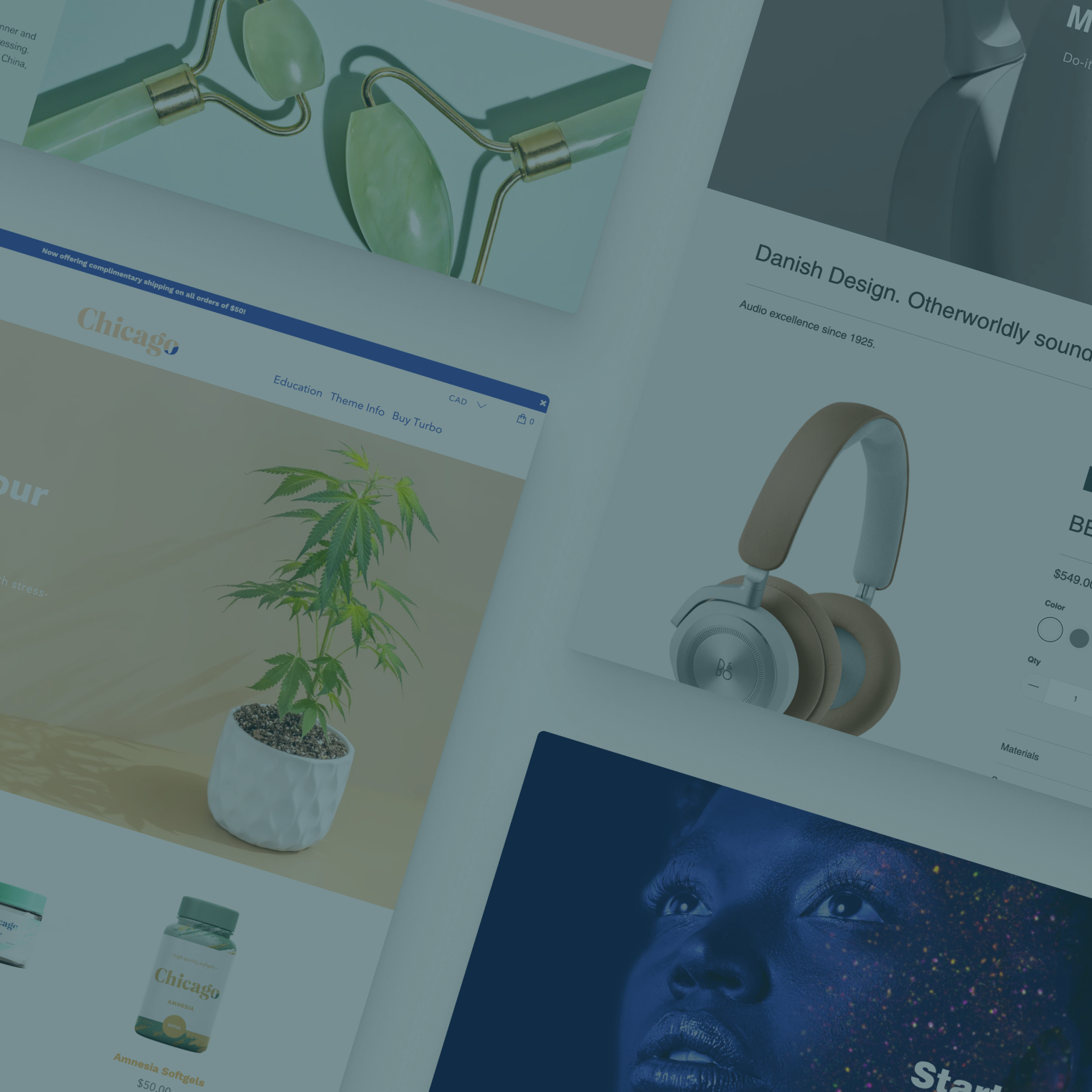
Collectively, the use of a large image with text at the top of a page is referred to by a myriad of names — you might hear it referred to as a hero, slideshow, banner, full width banner, carousel, featured image or slider.
While the exact definition of each of these terms can vary depending on who you're talking to, the meanings aren't really important for the sake of this article — we will refer to it from now as a ‘hero’ image.
Section options
In most Shopify themes, there are two distinct sections that store owners typically use, to create this type of hero element — “Slideshow” and “Image with text overlay.”
The key difference between these two section types is that the slideshow allows more than one design to rotate through without taking up any more real estate.
However, the beauty of using a Shopify theme that is enabled to use sections is that you get full control over not only what content appears on your homepage, but what order it is in, meaning any section on your homepage can be moved to that first position (with the notable exception of the footer, which makes a certain amount of sense).
While the whole idea of shifting away from using a large slideshow or banner at the top of your homepage might seem a bit scary or even off the wall, it's worth noting that there are, like most concepts in design, some schools of thought that question the use of these large images.
Points to consider
Here are some of the key reasons often cited for why these might not always be the best idea for a site:
- By definition, it's large, which does mean it can be eye catching, but it can also add to page load time.
- It can sometimes be difficult to select imagery that "speaks" to the main messaging of your site.
- In order for these elements to be responsive for a variety of device sizes, it can be challenging to find imagery that, when "cropped" still looks good and "reads" well on screen.
- For slideshow style elements, it can be difficult to decide which slide should be first since users may not stick around long enough to see all of them.
- Selecting imagery and crafting text that's eye catching, succinct and gets your message across effectively can be a challenge, especially if you have a more complex brand or don't have access to a variety of quality imagery.
- Often these areas become nothing more than window dressing and don't add real value to the page or drive sales.
- These elements don't always have a clear call to action or purpose either at all or that is relevant to all users, making them a "drive by" element.
- Users have become "blind" to these large elements and, in many ways, think of them as advertisements or uninformative window dressing.
While all these points have merits for many stores, it's likely that just as many other store owners might not experience the same issues.
Alternative ideas
If you are interested in pursuing alternatives to the standard large image and text block at the top of your homepage, here are some ideas:
- Use a featured product section to place a handful of your products at the top of the page. This is most effective for stores that sell just a few items, but it's also worth considering if your store is finely focused and a single product or two are representative of what you offer. Don't forget you can also use a heading element, if available, to help explain what your store is all about.

- Use a rich text with image section, to start things off with either just text, or a smaller, centered image followed by your mission statement, shop narrative or other content.
- Testimonials, especially ones with imagery, can sometimes be a good way to draw users in right off the bat, especially if you're selling in a category where trust might be more important. With some clever attention to your testimonial configurations, you can also make it easier for visitors to tell what your store sells.

- If your shoppers tend to be very "goal oriented" and not swayed by fancy promotions, consider using a collection list section at the top of your homepage. This can be a great way to "get down to business" and get your shoppers, well, shopping.
- Likewise, consider using featured promotions to link customers to different areas of your site. Since these sections tend to allow more than one block on the same line, they can be a good way to give your shoppers a clear choice of directions. Stores that sell in a few very distinct categories likely will benefit most from this approach.
- If your product or service is especially hard to explain or understand, you could consider using featured promotions to create a "how it works" segment that users see right off the bat. Some stores can also benefit from linking to more detailed content pages or even blog posts to help shoppers understand the product or service being offered better.

- Keep in mind that you're not restricted to using a particular section for what it was originally designed for, which can open up even more possibilities for your homepage. Try stacking several “image with text” sections at the top of the page for example; depending on the styling of that section for your theme, it could generate a more interesting layout than one large hero image. Our "Section By Section" series has more great ways to use sections in creative ways.
- If you're using the Turbo Shopify theme, using one or more of the text and image columns section type can also be a great way to build some creative and slick looks for the top of your homepage that link to a collections, products, information or blog posts.

- You can also experiment with using a large banner-style section at the top of your homepage in a slightly different way: Creating intrigue or mystery. Often this can be done by making an eye-catching claim about your products or service or by touting the unique features or selling points you offer. This can be done effectively with just text — or text accompanied by an abstract image.
- If you're not quite ready to give up on a full banner or slideshow, another thing to consider is experimenting with the overall height of the section. Try a long ‘skinny’ image with a very rectangular, almost panoramic aspect ratio (3:1) rather than an image that’s more square. See our San Francisco demo shop for an example. This can sometimes be a good compromise between offering a large, eye-catching image but also making it easier for users to see other content at a glance.
A few additional things to note:
- You may need to disable “Position header over content” in the Header settings if your theme currently has that enabled; this setting displays the main menu nav over the contents of the first section, which works well if it’s a big image but not so much if you have something like a featured collection there instead.
- You can experiment easily with how things might look in your shop without the hero image in the first section, simply by hiding it in the theme editor (click on the eye icon) and moving a different section into that top position instead
- Use a background color for the header or top bar if your top area is looking a little too bare or floaty without a big image there; these elements are typically a great way to anchor your homepage.
- It's important to keep in mind that using almost any section type in the first position can create a result that's surprisingly similar to a slideshow or banner — but it can bring more value to the page and get shoppers pointed in the right direction more effectively. With some creativity and experimentation, you can break away from the rather over-used hero image at the entry point to your shop and increase shopper engagement by presenting them with something different.