
Navigation menus are one of the most important elements of your Shopify theme because they help orient and guide the user throughout your shop. These menus affect how shoppers discover your product offerings, as well as any other info they may be seeking.
Don’t worry about mega menus
Mega menus, which feature large dropdown panels that appear when a user hovers over a first level navigational element, are rather trendy these days.
Often these second level menus include not only additional links to subsections but also feature images, promotions and other content directly within the menu space.
Another common feature of mega menus is that, when a user interacts with one or more links at the second level, an additional menu is displayed or triggered. A simpler implementation of mega menus is to simply arrange links in a smaller dropdown menu with two or more columns.
The whole idea of mega menus is to give users quick and easy access to highly specific areas of the site, including sub-collections or other content, within the minimum amount of screen real estate.
While mega menus or multi-column dropdowns definitely look cool and can be helpful in getting users to navigate around your store, they can also be tricky to implement within the Shopify platform given the limitations of the navigation menus.
They also can add substantially to load time and can be challenging to effectively modify for responsive design for mobile users.
Also, for mega menus to be as effective as possible, they must be carefully designed and coded, which can add significantly to implementation costs if your theme doesn’t already include this feature.
Do focus on making your navigation clear and easy
Instead of spending time and energy implementing mega menus, make use of the existing navigational features of your theme.
Most Shopify themes include dropdown menus that can, in some cases, go several levels deep.
Unless your store has a very large number of different products, this type of navigation is typically highly effective, easier to maintain and just fine for helping customers find what they’re looking for.
It’s easy for store owners to get caught up in the glitz of a mega menu and want to implement it on their own site. However, this is often done more for the “slick factor” than practical reasons and more often than not, most sites don’t need such detailed navigation.
Do break down bigger menus
If one of your navigation menus is so large that it needs multiple columns or a mega menu-style design, there’s a good chance it’s going to be overwhelming to your customers no matter what you do to the look and feel.
Take this as a sign that you may need to rethink your site navigation and organization and work within the confines of your Shopify theme — these limitations are often in place for a reason.
Try and think of ways you can group your products into larger, more intuitive collections or categories so that shoppers can find them easily. This is especially true if you don’t have many products of a specific type; for example, rather than have three separate menu links for “plates,” “cups” and “cutlery” if you only have two or three products of each type, try grouping them all in a “Dishware” collection that you link to from your main navigation, and then tag individual products with any relevant terms instead.
Don’t worry about advanced filtering or faceted browsing
One of the other most common navigation-related requests from Shopify store owners is advanced filtering or faceted browsing.
Popularized by ecommerce giants such as Amazon, these menus allow users to, typically with collection level pages, only show products that match specific criteria, such as manufacturer, color, size or other characteristics. These systems can also include “drill down” capabilities that change dynamically based on the current selection.
While most Shopify themes do feature some filtering capabilities on collection pages as well as the ability to include custom menus in collection page sidebars, these typically aren’t as advanced as those you’d find the ecommerce giants using.
While it’s possible to implement these advanced filtering and faceted browsing capabilities with Shopify, it typically requires an app or custom code to do correctly. However, customizing a Shopify theme comes with its own challenges and apps can also cause additional issues so do consider whether the results will outweigh any investment of time and money
Do spend time organizing your store
Instead of implementing complex filtering and faceted navigation, spend time making sure your products are well organized into collections, including creating very specific collections with a handful of highly relevant products.
You can use collections to group products by a variety of characteristics, including most of those which advanced filtering and faceted navigation would use. For example, a collection could be created for just black men’s pants or all natural hand lotions.
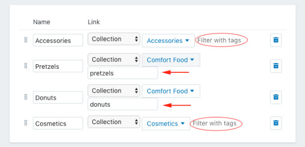
If building this many collections isn’t practical for you, you can also use various methods to filter the same collection in different ways, to give the illusion of having more specific collections. For example, you can create a link to a collection in one of your menus and choose to filter it with tags to only display the items in that collection that match that tag:
Another trick involves linking directly to URL paths that already contain a keyword in the address. For example, take this URL pattern: /search?type=product&q=term.
If a user visits this URL, he or she will see all products that match the keyword (that’s where “term” appears in the example). Although this technically leverages the search tool, the experience is very similar to browsing collections in most themes.
Keep in mind that filtering and faceted browsing is often most effective for stores with extremely large inventories and a broad customer base. It’s also tricky to do right from a user experience standpoint and can end up being more confusing or too specific for less advanced shoppers.
Finally, don’t lose sight of the value of your Shopify store’s search function. This can be a great way to help users find specific products, though it does require you to ensure your products are comprehensively and accurately tagged.
Do use best practices for navigation throughout the site
Navigating the pages of an online shop is akin to a shopper browsing through the aisles of a brick-and-mortar store.
Visitors will sometimes want to browse, and other times they’ll want to head straight to the item they came for; keep both of these shopper types in mind and make it easy for them to move within and between the pages of your Shopify store.
Here are a few additional and easy-to-implement tips:
- Use a sticky header option for your top bar, if you theme offers it; this keeps the main navigation menu locked in place at the top of the page even as the user scrolls down, so they always have access to your shop’s "directory"
- Make links obvious (choose a color that stands out or style them with underlines, or other design accents) and use them often to provide the shopper with related info; this encourages exploration and discoverability in your shop
- Make menu links finger-friendly on mobile: make sure the font size used for your shop’s navigation menu is big enough, and that the links are spaced far enough apart on mobile, so that they’re easy to tap accurately on small screens