If there’s one thing Shopify merchants love about our Flex theme, it's the ability to create a unique and visually-appealing storefront with ease. True to its name, Flex delivers the most extensive Shopify theme customization options, a refined visual design, and a seamless setup experience—however, we always like to challenge ourselves to push our themes even further!
In consultation with some of our most experienced Flex users (including our esteemed Brand Partner, Co-Curator) we identified some big insights to make Flex even more flexible to work with, customize, and extend.
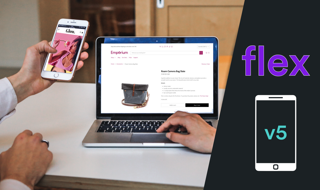
Introducing Flex v5, the most dynamic Shopify theme ever!
Revamped mobile experience
One thing was clear from user feedback: Flex is great for desktop but needs more mobile-specific settings. Flex v5 offers an abundant upgrade for mobile performance, customization, and conversions.

Better image with text layouts for mobile
Explore more options to arrange images in sections and offer engaging layouts for both mobile and desktop.
Mobile padding settings
Don’t fret over finding a compromise between mobile and desktop spacing settings. Optimize your spacing for mobile and desktop alike with top and bottom spacing for each section.

Different copy for mobile
Flex v5 lets you write different text for people shopping on their phones. This means you can make your messages more appealing to mobile shoppers. No need for general, one-size-fits-all messaging! Easily configure your content and optimize it for mobile and desktop.
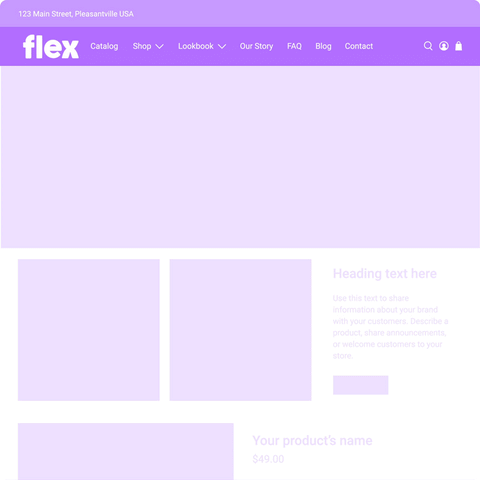
More sections, better sections
In Flex v5, we're also adding a new Grid section. Add this section to a template and watch the responsive image containers make any image look polished, consistent, and engaging.

Engage customers and search engines alike by adding headings and text to the section’s fields. Whether you’re promoting a sale, announcing a new product, or celebrating an event, the versatile Grid section is easy to use and your secret weapon for making visually-appealing storefronts.
If you showcase products with the Featured Collection section, Flex v5 offers new call-to-action feature to enhance product discovery. Keep the ball rolling and connect customers to the rest of that collection to find their purchase.
Settings simplified, design demystified
Flex’s customization options, styles, and settings are unmatched by any other Shopify theme. Revisiting the theme editor experience with all users in mind, setting by setting, resulted in substantial improvements for theme usability. Finding, adjusting, and optimizing settings has never been easier.
Design your dream storefront with more design options than any other Shopify theme. Fully compatible with Shopify’s theme editor, Flex is easier than ever to sculpt and shape.
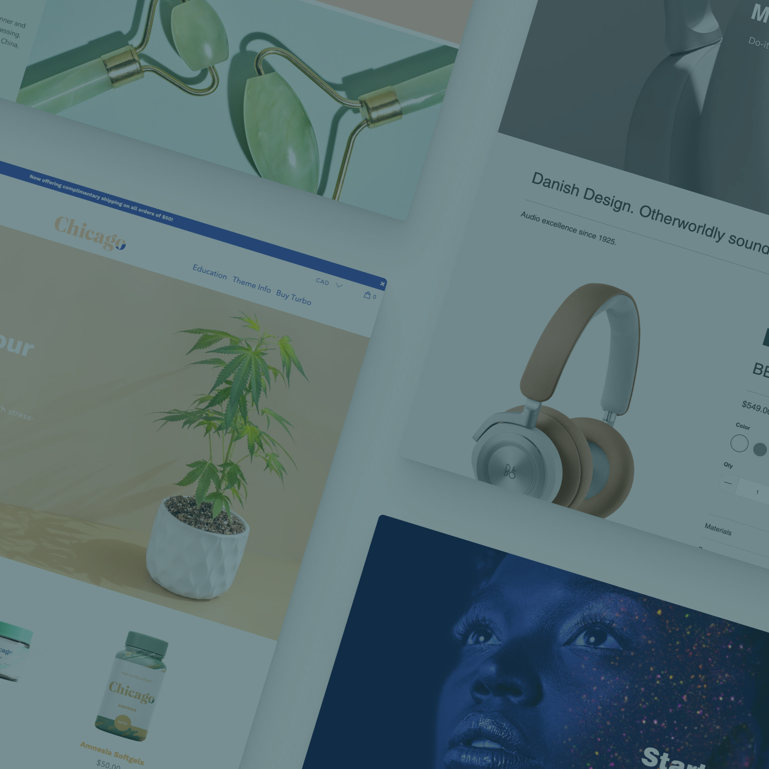
Check out the wide range of Flex storefronts by browsing the numerous demos, or by visiting the portfolios of Co-Curator and Jade Puma.
Enhance your flexibility
There’s never been a better time to get started with Flex. Upgrade to Flex v5 today and never compromise on a storefront again.
Already bought Flex? Upgrade to version 5 with Theme Updater Plus
