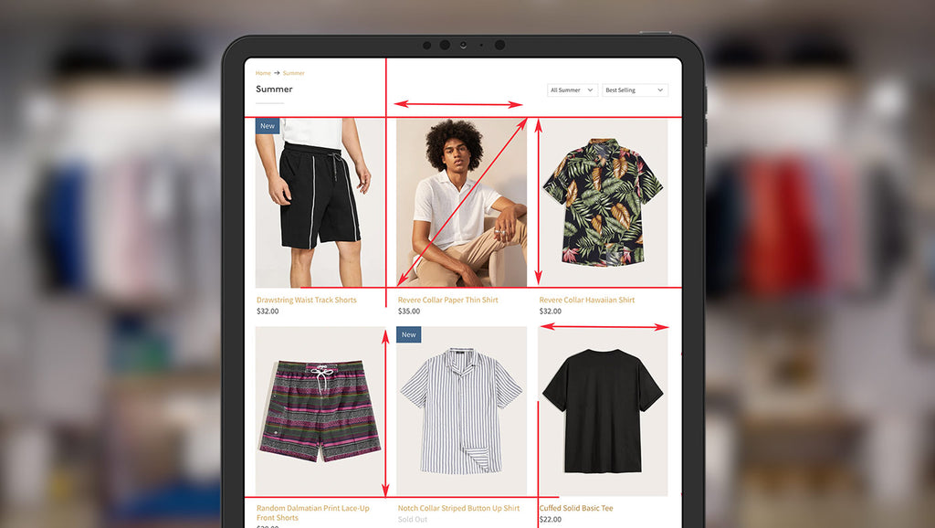
Most store owners would agree that great product photos are vital to the success of any online store. But, if you’re like many store owners using premium Shopify themes, you’ve gone through the process of uploading your beautiful photos only to find your collection pages aren’t lined up properly — so what can you do to avoid this?
Where does this problem come from?
One of the first questions store owners often have is why can’t the theme automatically make sure the rows of products on collection pages line up?
Most Shopify themes are designed to work for a wide range of stores that might have a wide variety of products — so they need to be designed to accommodate photos in a variety of sizes, aspect ratios and orientations.
For example, some store owners might prefer more square-shaped photos, while someone selling clothing might need tall photos to show off a full outfit on a model. Still others might prefer wider photos to show more detail or horizontal items.
The tricky thing for theme developers is that themes need to be able to accommodate all of those scenarios (and more) without any code modifications.
If Shopify themes were to “lock in” the collection photo size at, say, 250 pixels wide by 150 pixels high, then taller or square photos wouldn’t work as well — and could end up getting cropped in awkward places or stretched or compressed unattractively.
So, most Shopify themes, include those from Out of the Sandbox, opt to define only the width of the product photo and then let the height of each one be calculated automatically by the browser. While this allows for the full photo to always be displayed, it also leads to the uneven row issue.
On top of this, our Shopify themes often include settings for maximum height and width controls, as well as aspect ratio settings to bring more consistency to images in your store.
Ideal product image size
A common question from store owners is, what’s the best size to use for product images?
Although this varies widely depending on the theme being used, it’s a good idea, assuming you have access to high resolution product images, to create your images at a larger size than you need. This helps accommodate high resolution displays and is ideal for the product zoom feature.
Although the images you upload may be a larger dimension than will fit on your product pages, the theme is designed to automatically scale them down as needed.
Depending on the quality settings of the images and speed concerns, a good rule of thumb would be to make the images you create to upload between 1.5 to 2 times the size they will be displayed in. So, for Out of the Sandbox themes, this typically means between 750 to 1,300 pixels wide.
For full compatibility with Apple retina and other high resolution displays, 2 times the size is required, though this can also cause your pages to load slowly, so use this advice with caution.
Consistency is key
The easiest way to fix the issue of image alignment on collections pages is to always upload all of your product photos at the exact same size or aspect ratio.
Typically this involves adding extra space around product photos that aren’t the right aspect ratio or considering alternative ways to photograph items.
To get started with this approach, first consider what types of items you carry and how you prefer to photograph them. If most of your items will frame nicely in a square space, then pick a size such as 800 by 800 pixels. If, like the case mentioned above, you need to show a full body model frequently, then a taller image size would work better.
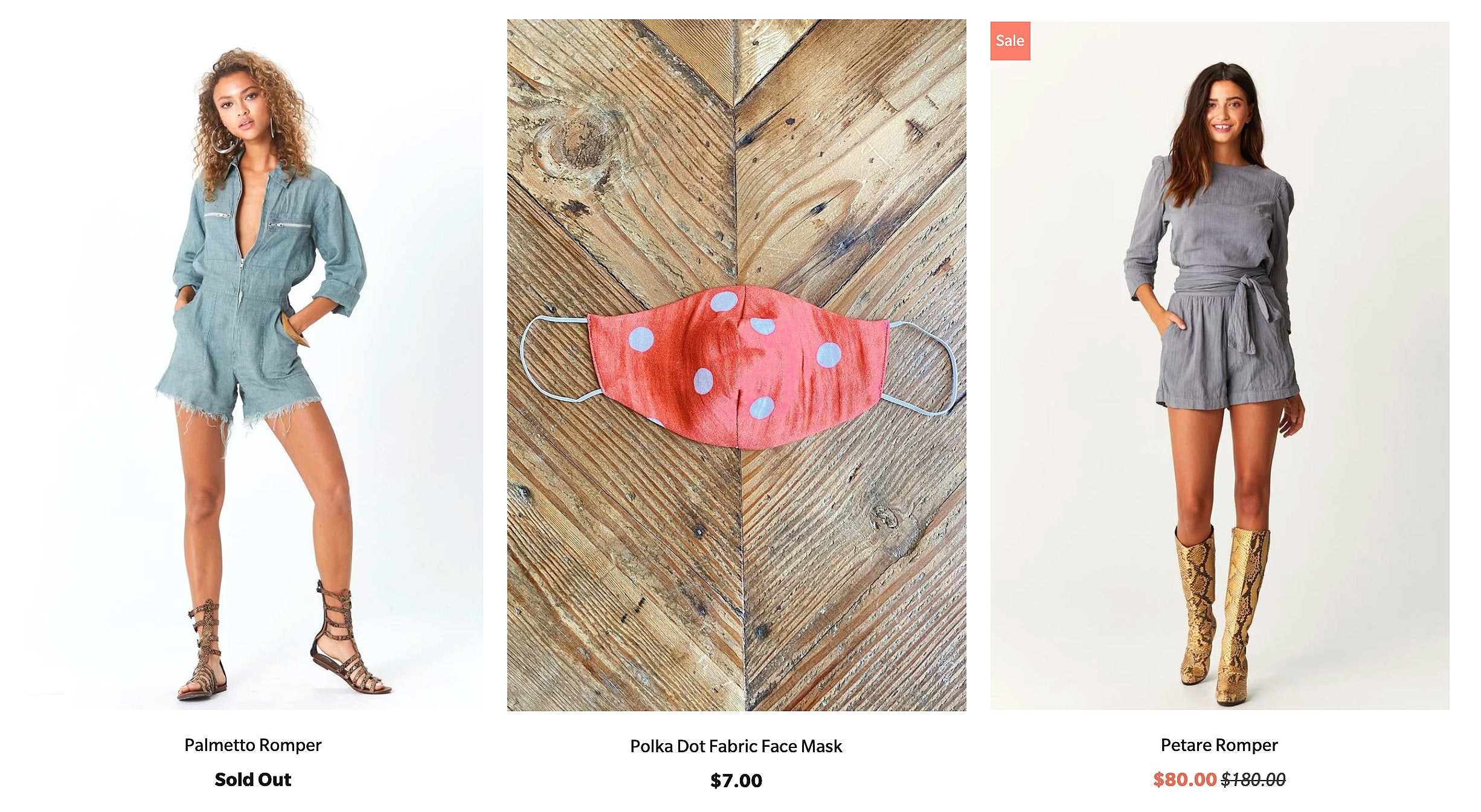
For example, the content source for our Parallax Los Angeles demo shop, Jen’s Pirate Booty, has used a particular aspect ratio consistently for all their product shots, no matter the 'shape' of the actual product being photographed. They cleverly made their mask photos long and vertical like the clothes shots so they all match:
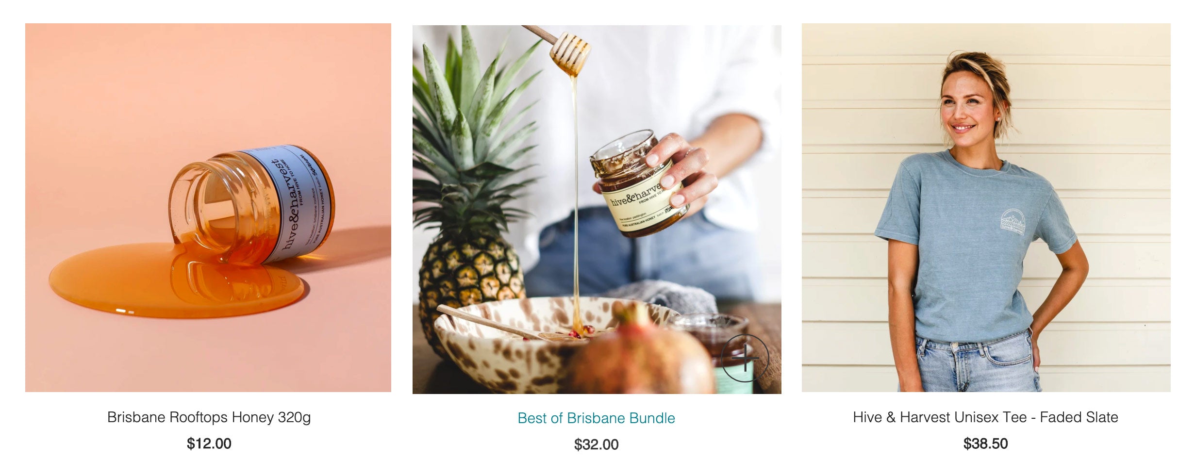
If you think square images will look best, Hive & Harvest have done a terrific job to make sure their images are consistent. No matter what the picture is (a single jar, a person, a scene) they’ve cropped all their photos to be the same size and therefore it all looks neat and tidy:
Once this is set, you should make a note of it. One trick many store owners use is to write down the exact dimensions on a sticky note or piece of paper and affix it to the monitor of the computer used to edit photos — this way you’ll always have the correct numbers handy when you need them.
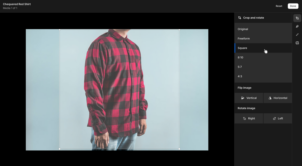
Shopify includes valuable tools for photo consistency as part of the Products editor. Use Shopify's Image Resizer tool to select one of the preset crop options, such as Square, then apply the same aspect ratio to each product image.
Some examples


For those not familiar with Photoshop, see if you can let whoever handles your photography know what size you need and let them handle resizing the images. Other options include free or low cost online photo editors or hiring a freelancer on UpWork or Fiverr.
Making modifications with CSS
If resizing your images isn’t an option, you can also make an advanced modification to your Shopify theme’s CSS to force the invisible “containers” that product images, titles and prices appear in on the collection page to be the same height — no matter what.
However, there are a few caveats to this:
- All of the product images on collections pages and related products on product pages will need to be the same height. There’s no way to adjust them individually.
- Although the theme will try its best to make images fit, if a product has an image that’s too large to fit in the height you’ve selected, you may end up with improperly cropped images or broken layouts. It may also cause your ‘sale’ or ‘new’ banners to become offset.
- Also, consider the amount of space product titles and prices take up on your collections pages and make sure to allow adequate room. If there’s a particularly long title or a price that jumps to two lines, it will get cut off or break the layout.
Other alignment considerations
Although photos sizing is the most common cause of broken collection page layouts, the issue can also arise if, for example, you have mostly one line product names but one particular one runs to two lines or vice-versa.
Most themes are designed to accommodate typical product title lengths (and then some), but this is an issue to keep in mind.
Likewise, it’s also possible for a product’s price, especially if it’s on sale or has a very high dollar value, to break the layout because the amount of characters makes this information spread to two lines.
Browse our themes to see how you can showcase your products online