The phrase “responsive design” seems to be all the rage in the web design world and it’s no doubt it should be a key part of any Shopify store owner’s strategy — but what exactly is it and why is it so important?
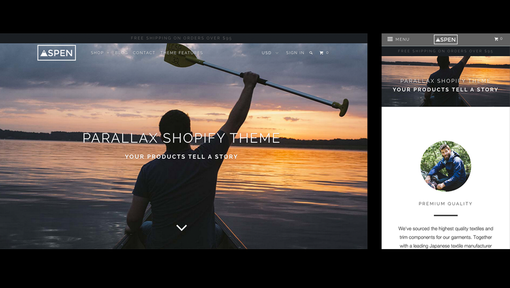
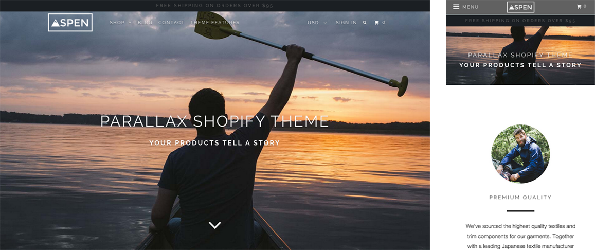
The name “responsive design” stems from the fact that the design of the site responds, in real time, to the size of the device and screen.
If you’ve never seen a responsive site on a mobile device, it can be a bit of a jarring experience.
For the smallest screen sizes, most responsive designs will make a website more vertically-stacked, eliminating design elements such as columns, to maximize the user of the available screen real estate. The use of icons over text navigation labels and multi-level navigation menus with “hidden parts” is also common.
Together, all of these techniques form a collection of best practice for responsive Web design that are users are becoming more and more comfortable with.
All of Out of the Sandbox Shopify themes are fully responsive, including one that bears the name Responsive, and have been carefully crafted to conform to all popular devices and screen sizes, which makes them ideal for any store owner looking to offer an online store that looks great no matter what the shopper is using to browse.
The magic behind responsive Shopify themes: Media queries
To create a responsive Shopify theme, Web designers make use of what are called CSS media queries.
Take this simple CSS code for example:
div.box-1 { width: 1180px; }
This line of CSS dictates that a <div> with a class name of box-1 should be 1180 pixels wide.
However, that’s obviously too wide to fit on, for example, an iPhone screen.
Using media queries, we can use CSS to tell the Web browser to use different styles based on the device width or viewport width.
Let’s look at this code as an example:
@media only screen and (min-device-width : 375px) {
 div.box-1 { width: 100%; }
 }
Assuming this CSS snippet was written below the other one in the stylesheet, the first line is telling the browser to use this special set of styles for devices with screens that are 375 pixels wide or smaller. Thanks to CSS’s precedence, since this code appears lower on the page, it will “override” the original code, but, thanks to the first line, only when the device width conditions are met.
The second line, meanwhile, says that instead of being 1180 pixels wide, if the device screen size is smaller than 375 pixels, the <div> should become 100 percent wide.
While writing media queries is outside the scope of this post, a variety of CSS techniques and tricks can be used to change the font sizes, sizes, colors and positioning of any element on a Web page based on the device or screen size or even based on what orientation the user is holding the device.
Why go responsive?
Responsive design is becoming more and more important to both Web designers and online shop owners for two key reasons.
First, responsive design helps deliver ideal user experience and usability in an increasingly mobile world.
As more and more Web browsing moves to mobile devices such as phones and tablets, it’s important to realize that more and more of your customers will be accessing your Shopify store on smaller screens.
Without a responsive site, your users will still be able to view your Shopify store, but will need to “pinch zoom” in to clearly read what a Web page says. Also, since ecommerce sites often require users to fill out multiple forms, which can be particular challenging to fill out on a mobile device, it’s even more important to make your Shopify store pages as easy to use on a smaller screen as possible.
Keeping your site easy to use on any device can play a huge role in your sales figures. If you’re like many Shopify store owners, you know the challenges of not only acquiring a new customer but ultimately getting them to purchase can be huge — so delivering a mobile optimized experience that makes it as easy as possible for users to browse and buy is vital.
The second key reason to make your Shopify site responsive is because Google is more likely to suggest mobile-friendly sites to users using its service to search on mobile devices and also includes a “mobile friendly” tag next to sites it detects are responsive or specifically designed for mobile devices (this includes responsive sites using media queries).
Both of these tactics are clear indicators that Google is placing more and more weight on ensuring experiences optimized for different devices and it’s likely these factors will become more and more important it search rankings.
Why not build a separate mobile site?
For a time, it was common for websites to have a completely separate mobile site that users would either have to directly visit (such as mobile.storedomain.com) or the Web server would need to be properly equipped to detect a mobile device and redirect the user accordingly.
However, responsive design offers many key advantages over this approach:
- URLs remain consistent across all devices, making it easier for users to share links that will display correctly no matter what device is used.
- Since the same URLs can be used in all cases, cross linking for SEO and site organizational purposes is more efficient.
- Although a CSS files does need to be expanded upon to include media queries, it is often much easier to maintain media queries than a completely separate set of files for a standalone mobile site.
- Since only one physical copy of each page exists (rather than one desktop version and one mobile version), you don’t need to worry about having duplicate content available.
- Because mobile devices, which can encompass anything from tablets to smartphones, come in an every-increasing myriad of sizes and orientations, you can deliver an optimized design for as many unique situations as you need — rather than just a “mobile” and “desktop” one.
- Media queries are more foolproof and don’t require advanced server configurations or code to attempt to direct users to the appropriate version of a site (and therefore less likely to send someone to the wrong version).
What to look for in a responsive Shopify theme
When considering a new Shopify theme for your online store, it’s important to consider these points:
- The design and layout should be as consistent as possible. Of course, given the big differences in screen sizes, having total consistency isn’t going to be practical, but a well designed responsive Shopify theme will make it clear the user is still on the same site and interacting with the same brand.
- The navigation should be clean, easy to use and make use of multiple levels to make it easy for users to find the products they are looking for.
- The responsive version should make it easy to see photos, read descriptions and make a purchase. Remember that mobile device screens are smaller and users are more likely to be using them in less-than-ideal conditions (such as outdoors or on public transit).
- A good responsive Shopify theme should also take into consideration that tapping a button or link with a finger is a bit more difficult than clicking with a mouse; small or closely spaced buttons can cause frustration when users inadvertently tap the wrong one.
- Be sure to preview the Shopify themes you’re considering on your mobile phone, tablet and desktop to see how the experience is the same and different to familiarize yourself with how the theme designer implemented responsive Web design techniques.